

How to represent population density in a map
Representing the population density of a territory is not an easy task. Here are some examples of how cartography has found different ways of doing so across history.

Have you ever wondered how many people live in the world? It is a question that many of us have asked ourselves sporadically, but it is a figure that has been constantly changing throughout our lives. In 1987, we reached 5 billion inhabitants, in 1998 6 billion, in 2010 7 billion, and in 2022 8 billion1.
These are the UN’s estimates, but the truth is that we do not actually have reliable data. Many countries conduct censuses every decade or more, making it difficult to obtain up-to-date data. Moreover, several countries have no reliable way of knowing how many inhabitants live within their borders. The margin of error is estimated at 2% or 3%, so although the estimates might not be exact, we can definitely say that there are a lot of us.
That said, it is much more interesting to understand how that population is distributed. If we were to make a rough calculation, worldwide we would have a density per square kilometre of about 63 inhabitants per square kilometre, according to data from 20252. The differences between countries are enormous, which is why we usually talk about population density per country, but there are also extreme situations within each country. A clear example is Russia, where Nenetsia has a population density of 0.23 inhabitants per square kilometre, while the capital, Moscow, has a density of over 5,000 inhabitants per square kilometre.
Let’s dive into how population density has traditionally been represented, as well as some much more fascinating recent approaches.
Classic population density maps
Population density maps have existed practically since the introduction of modern censuses. Once the population residing in each part of a country was known, it became important for countries to visualise this distribution to better understand possible ways of establishing transport, communication, or basic public service policies.
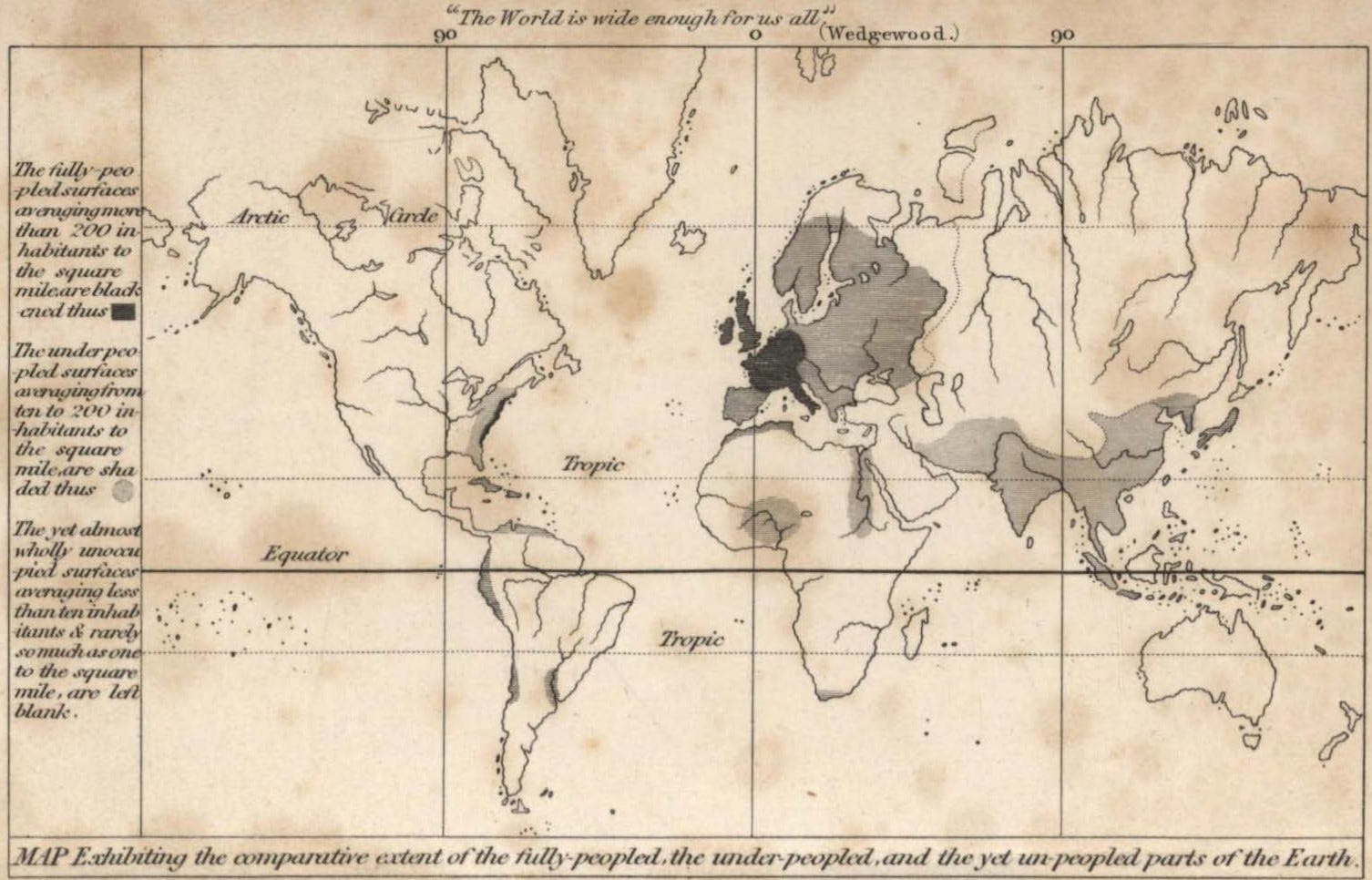
The first population density maps appeared in the 19th century, being George Julius Poulett Scrope a pioneer with this world population density map in 1833.
It certainly lacked any kind of detail, but the problem to be solved was not an easy one. What is the best way to represent population density on a map? If we stick to the information from a single point, the map is illegible, but if I group too much territory together, such as the map above, the map’s usefulness is lost. The key was compromise, which came just four years after Scrope’s map, courtesy of Henry Drury Harness and this incredible map of Ireland.

This map was revolutionary in many ways. Not only was it the first truly useful population density map, for evaluating and planning the railway system in Ireland, but it is also the first map to use choropleths3 to represent data on a map. In this case, inhabitants and how spread they were.
Its innovation is evident in how the idea spread to represent data maps, not only population density maps, but of any kind. In a way, this was how graphic statistics found its way onto maps.

It is undeniable that these maps are extremely useful. If we take the example of Finland above, we can see at a glance that most of the country’s inhabitants are concentrated in the south, with hardly any people living in the higher latitudes. It can also be seen that there are some regions with a higher population density, which correspond to the country’s main cities.
However, it is impossible to determine whether Turku or Tampere have more or fewer inhabitants than Helsinki. It is also extremely difficult to tell if the population in these cities are concentrated in a minimal area of their province or, on the contrary, they are evenly distributed over all the territory.
Despite their limitations, these maps continued to be used for more than a century, as they were a simple way of representing population density, especially given the technological limitations of the time: paper and ink.
Alasdair Rae, population density in three dimensions
Just six years ago, Alasdair Rae began creating population density maps using the advanced data visualisation capabilities of new technologies. In these maps, he took small grids and represented population density as lines of different sizes for each grid. This allowed each high-density population centre to appear as a mountainous area on a three-dimensional map. This is how he gradually put together this wonderful map of world population density in 2020.

This map is truly incredible, as it allows you to quickly identify which areas of the planet have the highest population concentrations, while also making it easy to find large urban agglomerations living in a small space. It is immediately apparent that Pakistan, India, and Bangladesh have what is possibly the highest consistent population density on the planet, followed closely by eastern China and the Philippines.
If you look closely, you can see that there are many large bars in the Philippines, but there is one that stands three or four times above the rest, which corresponds to the metropolitan area of Manila. This capital city is the most densely populated city on the planet, with a density of more than 43,000 inhabitants per square kilometre.
When looking at this map for the first time, you may also be struck by how empty the planet is. We are not just talking about Siberia, the Sahara, or the Amazon. Canada, Australia and almost all of South America are practically uninhabited. Hardly anyone lives in western China, nor in the rest of Central Asia. Africa, for its part, has densely populated regions such as the Nile Delta, Ethiopia, Nigeria, and the area around Lake Victoria, but the rest is surprisingly empty.
Terence Teo, the population of each country in three dimensions
Along the same lines as Alasdair Rae’s work, we find the maps of Terence Teo. At the end of 2022, he began working on various population density maps using data provided by Kontur Population. Using R programming and the Rayshader package, he began to construct column maps of different countries around the world and published them on his various social media accounts. The first was this fabulous map of Taiwan.

This map was followed on his various social media accounts by maps of practically every country in the world, thanks to which we can understand a little better the diverse ways in which the population is distributed in different countries. Here are a few maps for you to enjoy some countries.


In the map catalogue, I am gradually compiling many of these maps by Terence Teo and have added some information about the different mountains that can be seen in each country. You can consult them here (there are 52 so far).
If you like this type of data processing in maps, I recommend you have a look at the rest of the work by Alasdair Rae (Website, Twitter, Visual Capitalist) and Terence Teo (Twitter, Mastodon, Bluesky, Visual Capitalist). You won’t be disappointed.
By popular demand, here’s a button for procrastinating, in case you have plenty of things to do, but you don’t feel like. Each time you click on it, it will take you to a different map from the more than 1,100 in the catalogue.
If you like what you read, don’t hesitate to subscribe to receive an email with each new article that is published.
I wrote about this, but from a complete different perspective, in this other article: The abyss of demographic winter.
Counting that there are 130 million square kilometres of land and about 8.2 billion people in the world
A choropleth map is a thematic map that uses different shades in predefined areas to represent values of a particular variable. In this particular case, population density.
This is great! I’ve seen some of Terence’s maps but didn’t realize he had so many. May have to steal the idea for a blog post.