

Three maps to understand the Internet
The Internet came to revolutionise our lives, and these three maps show how it has managed to connect us all.

It is fascinating how, looking back just 30 years, we find an entirely different world. The Internet was in its infancy and only available to a few. It was possible to communicate by email, but access to information through this medium was still limited1. Mobile telephony was also in its earliest stages, and the combination of both technologies to create smartphones was something that no visionary had even imagined.
For me, the world is much more than the Internet and mobile phones, undoubtedly. I can still enjoy sports and nature, I like to socialise with people face to face, enjoy long walks and reading books in physical format2. But if I am honest with myself, I find it impossible to imagine a world without the Internet in which I could enjoy life to the full.
So, as a tribute, today I'm writing this brief article, worthy of summer, with three maps to give you a glimpse of the immensity of this revolutionary technology.
Global Internet Map (2022)
Every year, TeleGeography publishes a handful of maps that help to understand the current state of the Internet in detail. Its global map shows the main communication nodes in the world and the volume of information transmitted between each of these nodes.
As usual, Europe remains the region with the highest number of relevant nodes3 and where communications between them have the highest ratio. Growth continues to be higher in Asia, the Middle East and Africa, but everything points to European dominance continuing throughout this decade and the next.

If you browse the details of the map, you can also find out how Internet access prices, traffic, and capacity are evolving, as well as the growth of cloud infrastructure, which is shaping the future of information storage and access.
Submarine cabling (2023)
The submarine cabling map is also the work of TeleGeography. In its 2023 version, the infographic takes on a vintage style, although it shows the current status of all the cables crossing seas and oceans, including those whose construction is already planned or underway.
In total, the map shows 529 submarine cable systems, with a total of 1,444 points where they connect to land.
")
Its interactive version allows you to explore the details of each of the systems and connection points, as well as the specifications in terms of speed and use of these cables.
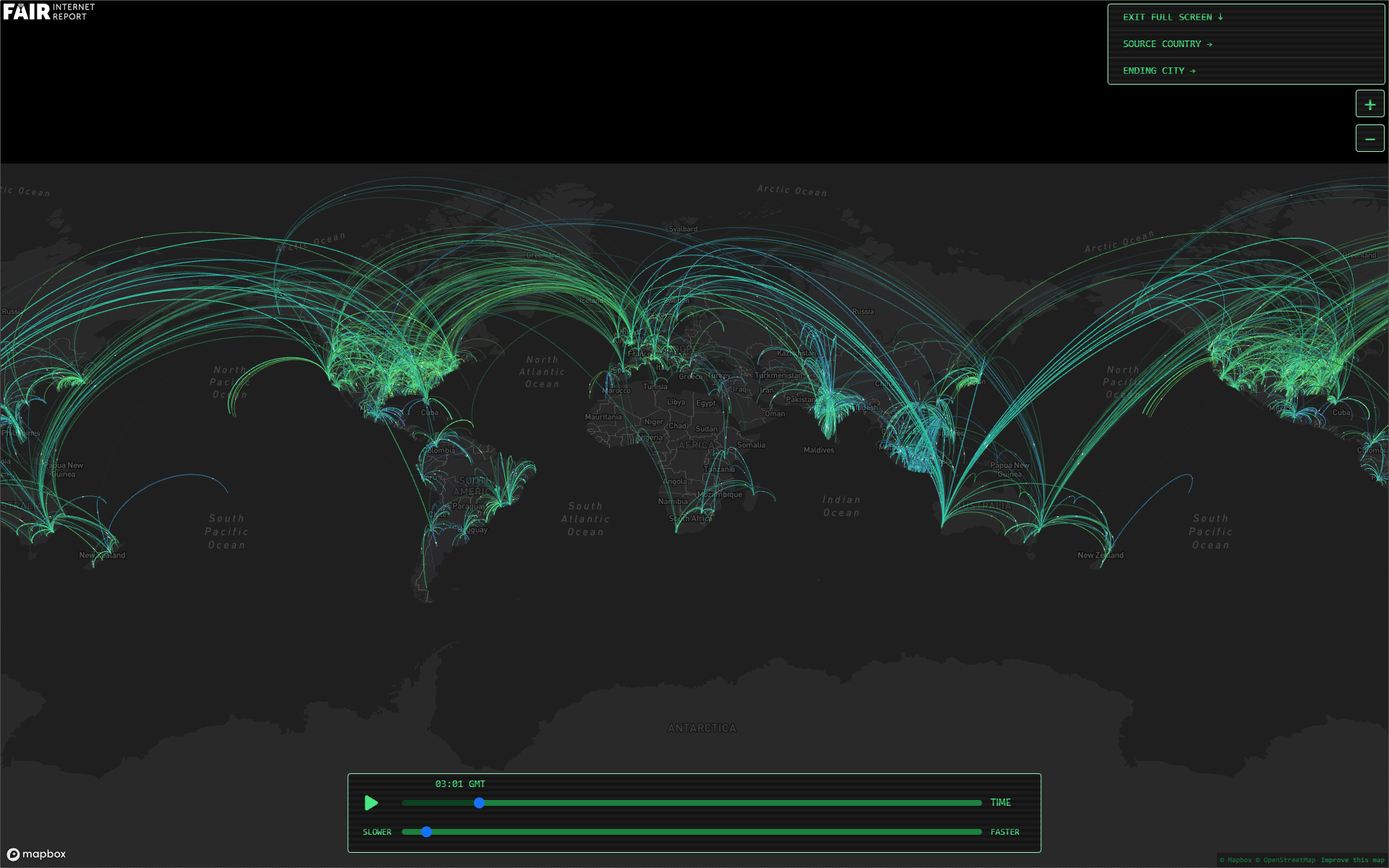
The heartbeat of the Internet
The third and final item in today's newsletter is a real gem. It is an interactive map showing all the speed tests carried out around the world over a 24-hour period, drawing a line between the location where the test is carried out and the location of the server used.
Practically, all of us have used these tests at some point to check if our service provider is really giving us the bandwidth we have contracted. But in addition to individuals, a multitude of automated services run these tests on a recurring basis to measure response times to other regions of the world. If you browse through the 24-hour video, you can see how these automated tests are run consistently hour after hour, creating that peculiar heartbeat that somehow keeps the Internet alive.
By popular demand, here’s a button for procrastinating, in case you have plenty of things to do, but you don’t feel like. Each time you click on it, it will take you to a different map from the more than 1,100 in the catalogue.
If you like what you read, don’t hesitate to subscribe to receive an email with each new article that is published.
Not equally in all countries. In some, such as Spain, where I live, most people did not have Internet access at home until the early 2000s.
I openly admit that I have not managed to get used to e-books.
Frankfurt, Amsterdam, Paris, and London at the top.
Such a short, beautiful piece. It's interesting to think of the different ways in which the world is connected, and yes, indeed, a heartbeat is a perfect metaphor for the pulse of technology!
It’s in many ways a friend to the old and a bane on humanity. Great article. Thank you.