

The true size of countries
Cartographic projections distort countries, which can lead us to believe that some countries are larger or smaller than others. Sometimes, this is not true.

A couple of weeks ago, I wrote about how cartographic projections, for purely mathematical reasons, have to distort the Earth's surface to represent it. These distortions can be in angles, shapes, distances or sizes, without being possible to respect all three simultaneously. When the most popular projection ends up being one that alters the area of countries, as it was the case with the Mercator projection, it is extremely easy to make wrong assumptions when comparing them with others.
Today, I bring you a list of comparisons that we often interpret wrongly, partially because we are not familiar with regions that are far away from us.
Greenland vs. Africa
If there is one example that is well-known, but no less surprising, it is that of Africa and Greenland. Africa is a continent located around the equator, the point on Earth that appears smaller in the Mercator projection. In contrast, Greenland is located near the North Pole, above the 60°N parallel, one of the regions that appears most overrepresented in this projection.
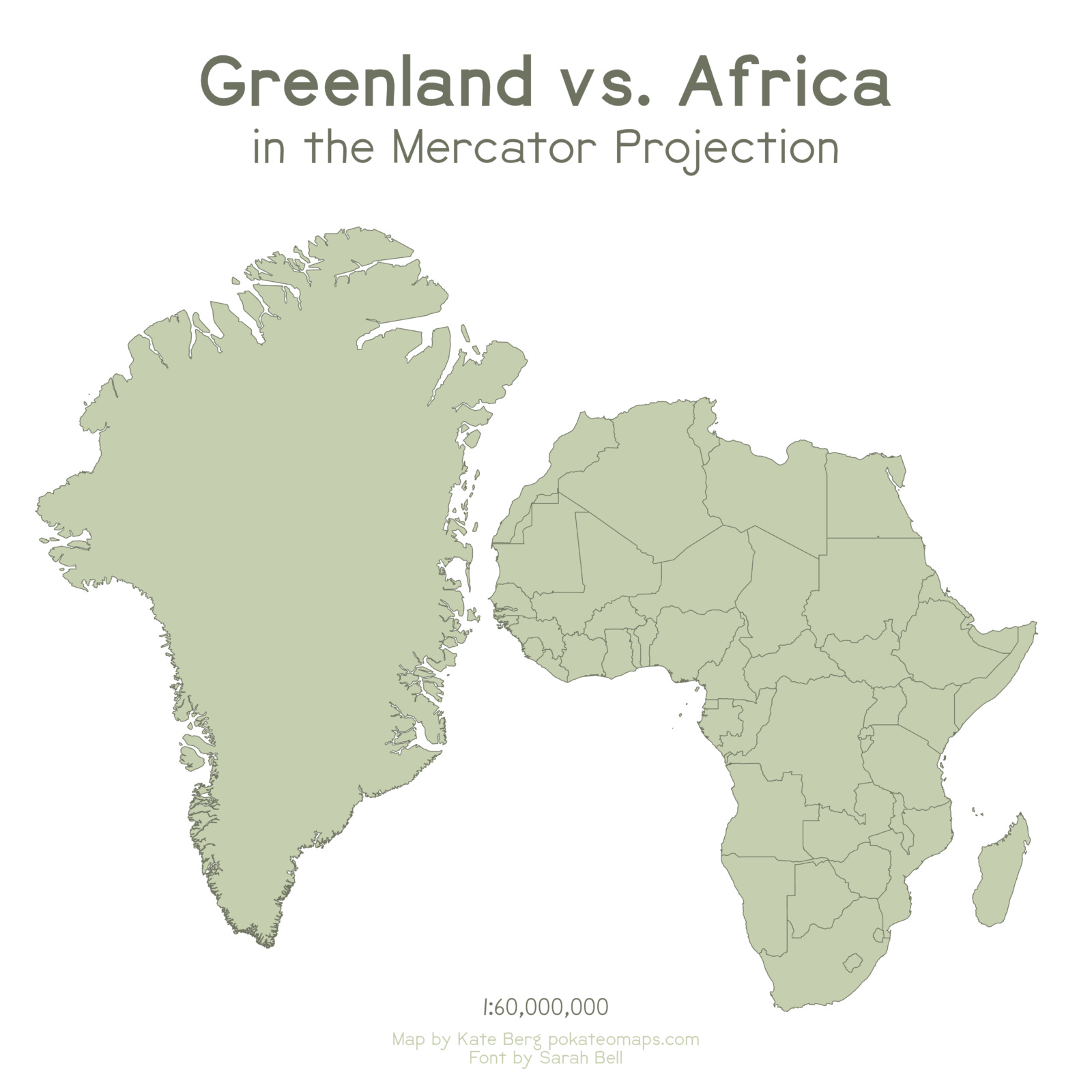
As a result, Greenland and Africa appear to be similar in size. For anyone who has only ever seen this type of map, it may come as a surprise to learn that Greenland is actually 14 times smaller than Africa. This is the level of distortion in sizes caused by cylindrical projections that follow a pattern similar to Mercator's.

If we draw both regions with the Mollweide projection1, we find a very different reality. One of the things I like to emphasise is that all projections have their virtues and their problems, so it is important to know how to choose the right projection to obtain the information we are looking for. If the aim is to compare sizes, Mercator will never be the correct choice, but any projection that maintains sizes, such as Mollweide, can be.
How long is Chile?
This will come as no surprise to any Chilean, or indeed to any South American. Chile is a very long country, extremely long. In fact, even the Guinness Book of Records considers Chile to be the longest country in the world, at least if we compare the relative size of its length of around 4,300 kilometres with an average width of 177 kilometres. This in itself says little, so I will make it a little more visual.

This is the comparative size of Chile and Europe2. It seems crazy, but the distance from north to south in Chile is the same as from the south of Spain to the north of Norway, two of the extreme points of Europe. The most curious thing is that Brazil, from north to south, is even longer than Chile, although being wider, it is less striking.
And continuing with Chile, have you ever wondered how many Chiles you are away from Chile? No? Well, I'm here to answer a question you've never asked yourself.
")
This map shows the distance between each country in the world and Chile. All of South America is less than one Chile away from Chile, and all of Europe is less than three Chiles away. There is only one small region on the planet, in the interior of China, that is more than four Chiles away. Unsurprisingly, it is the antipode of central Chile.
Los divagues de Ruy
There are almost as many comparative maps on the Internet as there are people who have tried to make one. We could almost consider it a single topic for cartophiles3, like many of you reading this. But today I want to share a very cool collection, by Ruy Pinto Schaffroth on his Facebook page, Los divagues de Ruy. He has deleted many of them from Facebook, but you can still find them in various corners of the Internet. Here are some maps of Peru, Argentina and Colombia, compared with European countries4.
")
")
")
The true size of…
Finally, to keep you entertained, here's a website where you can make your own comparisons. The true size of… is a website created by James Talmage and Damon Maneice, inspired by The West Wing5 and Kai Krause's famous infographic on Africa6.
The website is fully interactive and allows you to create any comparative maps you want. Just search for the country and then move it to another point on the planet. You can even stack countries until you fill the entire size of Algeria, as I did on this map I put together years ago when I was bored.
")
And that's it for now.
Have a wonderful weekend.
The main feature of the Mollweide projection is that it maintains sizes, apart from distorting distances and shapes. Here you can find more information about this projection.
Years ago, I posted this on Twitter and it became somehow viral. In Europe, we have no idea of the size of Chile.
I know, not a common word, but I’m not the first one using it.
There are more maps of this type published by Ruy. I am gradually uploading them to the map catalogue, where you can view them here.
More specifically, this well-known scene from the series.
At last, Big Block of Cheese Day!
At a local trivia event, one of the questions was to name the fifth largest country in the world. Our team confidently wrote down “Australia.” Nope. Brazil.