

The “correct” map
The Mercator map creates distortions. Just like the Peters map and any map with any projection on a plane. This is the story of the correct map, the map that does not exist.

The correct map does not exist.
I could almost end today's post there, but I'm going to say it with a little more emphasis. Or rather, I'll write it in bold, which is the only non-aggressive way I can think of to emphasize it on the Internet.
The correct map does not exist.
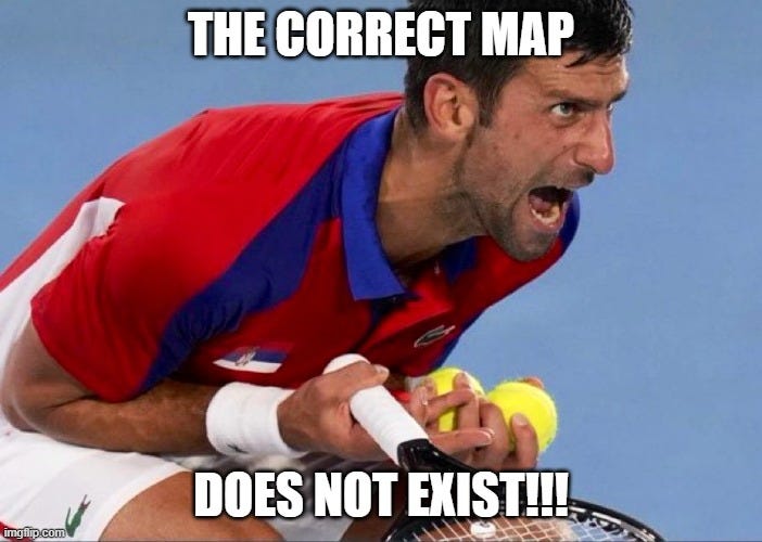
Just in case, I will also use a well-known meme so that it can be shared on social media and popularize the message that many of us have been spreading for decades.
I could have told you all this any day, but just last week I read that the African Union has joined the Correct the Map campaign. I don't think the campaign itself is a bad idea, and I'll explain some points in its favour below, but I don't like that it's based on the eternal idea that a map needs to be corrected because it's “wrong.” A projection, as long as it's mathematically correct, is never wrong in itself.
The problem, as I have mentioned here before, is that it is mathematically impossible to transfer the surface of a sphere onto a plane while maintaining all the characteristics of the sphere's surface1. If you try to preserve any of these three properties, the rest will be compromised to some extent:
Angles: that all the polygons we draw on the sphere, for example, the outline of a country, retain their shape once transferred to the map.
Areas: that all the polygons we draw on the sphere, once transferred to the map, retain their area.
Distances: that any two points on the sphere retain the distance between them on the map.
Throughout history, many cartographic projections have been defined. The first to be used, because of its simplicity, was the equidistant cylindrical projection, attributed to Marino of Tyre2. Subsequently, many other cylindrical and conical projections with different characteristics appeared, but none achieved the level of success that Mercator achieved with his projection in the 16th century.
")
This projection emerged during the navigation boom, and this is precisely why it was so successful. As it is a conformal projection, which maintains shapes and angles, it can be used at sea better than any other projection. If you follow any straight line on the map with the direction of the ship's compass, you are guaranteed to get from one point to another.
Navigation continued to be the main use of world maps until the end of the 19th century. Then, education began to become more widespread throughout the world and maps began to be used in schools to teach geography and history. This is where the problem arises: the Mercator projection is excellent at maintaining angles, but terrible at preserving area, creating large differences between equatorial areas (smaller) and polar areas (massive).
And criticism arose.
The shortcomings of Mercator's projection
Gerardus Mercator presented his projection in 1569, but he did not leave a written mathematical definition that would allow these maps to be created and interpreted correctly. We owe all this work to Edward Wright, who in 1599 published Certain Errors in Navigation3 and completed the work begun years earlier by Pedro Nunes. This mathematical definition included a table of values that served as a function to transform any latitude, up to 75°, and draw it on a map4.
Throughout the 17th century, the projection was used consistently, mainly by sailors, but it also reached other fields, as it became the default way of making a world map. There was no significant mathematical work seeking other projections, as Mercator's invention more than covered the main use.
In the 18th century, Johann Heinrich Lambert turned cartographic projections upside down. Some of you may know Lambert for his contributions to mathematics and physics5, but today I want to focus on cartography. Lambert was the first person to study cartographic projections in depth and demonstrated that a projection cannot be both conformal and equivalent. In other words, if you wish to maintain shapes, you have to sacrifice area. If you aim to maintain area, the outlines of islands and continents will be completely distorted.

In addition to this great advance in cartography, he also mathematically formalized seven other cartographic projections, three of which are conformal and four equivalent6. Among the equivalent projections, I have chosen the equivalent cylindrical projection that you can see above7. Looking at the circles, you can see areas remains constant regardless of latitude, but their shape is completely distorted as we approach the poles.
It is important to understand that Lambert worked extensively in the field of cartography, explaining the fundamental characteristics of a projection and the dependencies that existed between those characteristics. At no point did he criticize the Mercator projection or any other existing projection. Moreover, among his projections, Lambert introduced a modification to the Mercator projection known as the transverse Mercator projection.
This idea, introduced by Lambert in 1772, already showed that the same projection, taking a different reference, could be used to effectively show different regions. In the example above, the Greenwich meridian and the antimeridian are used as reference points, just as the equator is in the Mercator projection. Here you can see that the polar regions, West Africa, Western Europe, and New Zealand appear with almost no distortion, while the regions around the 90° east or west meridian appear greatly oversized and distorted, as is the case with Indonesia.
Gall's legitimate criticism
James Gall was possibly the first to openly criticize the use of the Mercator projection in an educational context. Although he devoted his life mainly to religion, he also worked in cartography, defining three new cartographic projections in 1855. For one of them, he took as reference Lambert's equivalent cylindrical projection and made some modifications to ensure that the parallels maintained a constant distance from each other, with a variation from the 45° north and 45° south parallels.
Originally, it was intended as a projection to represent the sky, but it ended up being used to represent the globe.
This was the result.
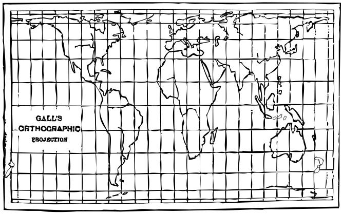
Gall did not directly criticize Mercator's projection until 1885, when he published an article explaining how his three projections significantly improved Mercator's one. His thesis begins by stating the reasons why Mercator's projection had prevailed over the rest, which from his perspective, were not Eurocentrism, but rather its validity for navigation. But of course, now that there were other uses for maps besides navigation, it was a good time to examine alternatives.
In that same article, Gall stressed that this orthographic projection was only useful if you wanted to compare the areas of different regions of the world, but that it was practically useless for any other purpose. For this very reason, he recommended the use of his stereographic projection, which has a more interesting balance between angles, areas, and shapes.
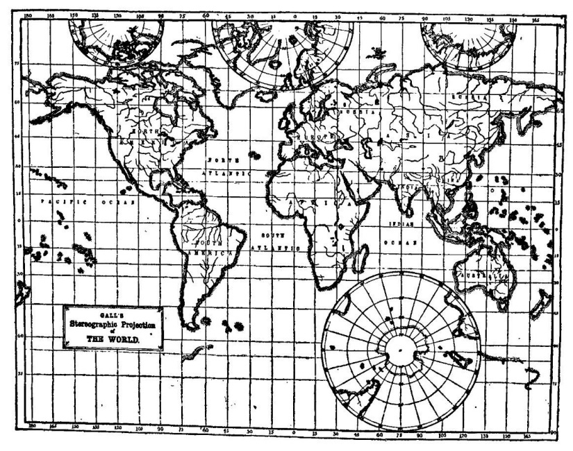
With this map, Gall sought to address the problem of polar regions, which cannot be represented in the Mercator projection. The southmost and northmost areas of the map do retain a larger size than the equatorial areas, but instead of multiplying their size by 15, as Mercator does, he limits it to a maximum of about 3 times. This was a necessary compromise so that shapes and distances would not be overly distorted.
Despite Gall's work, the Mercator projection remained the most popular in education until the mid-20th century, when it began to be replaced in atlases by other cylindrical projections that looked for a certain compromise, as it did Gall's stereographic projection.
Peters' opportunism
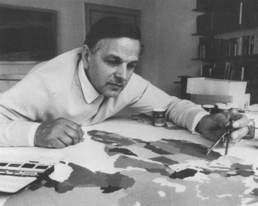
Arno Peters was a German filmmaker who, after training in Hollywood and trying to find his place on the German scene, took a radical turn in his career. In 1945, he completed a doctorate in art history and journalism, where he found his obsession: equitable graphic representations of history and propaganda. He focused mainly on timelines that showed the complete history of humanity equitably, not necessarily centred on Europe, about which he published an article in 1952.
His perception that Europe was extremely Eurocentric led him to search for a map that represented the world correctly, giving each continent its rightful weight. His search was unsuccessful, as he did not find a map that satisfied him, so he created his own projection, the Peters projection. The author himself always claimed that he had had this idea in his head since 1967, but he did not begin to promote it until a conference in Berlin in 1973.
")
From that moment on, he began a large-scale campaign charging against the Mercator projection and cartographers in general. According to Peters, all existing projections were based on a conception of the world that originated in the 16th century, when Europeans dominated and subjugated the rest of the world. Thus, all cartography is Eurocentric and sought to forcibly maintain the prevalence of Europe with cosmetic reforms, harming other regions of the world such as Africa and South America.
So far, the criticism may seem legitimate. It is true that, in many areas, Europe and the West overall have historically taken advantage of their position of power to impose certain views, greatly limiting what the rest of the world had to contribute. But when we begin to scratch beneath the surface, we encounter genuine opportunism.
During the propaganda campaign to promote his map, Peters repeatedly insisted that his projection was the first “correct” one in history, as it was the first to preserve the area of countries, the only feature he considered worthy. As we have already seen, this is far from true, as there have been many other equivalent projections of all kinds throughout history8.
Even worse, Peters did not create an original projection. Even if he did so independently and without knowledge of all previous cartography9, in 1973 he presented exactly the same projection as James Gall more than a hundred years earlier.
As his campaign began to succeed, criticism began to pour in from cartographers who had dedicated their lives to maps. The first, as it is obvious, was focused on the fact that his projection was nothing more than a copy of Gall's, something Peters denied throughout his life. At the same time, many other academics also criticized Peters' ignorance in calling himself the inventor of the first equivalent projection, entirely ignoring the history of cartography and the fact that many publishers were already using projections different from Mercator's.
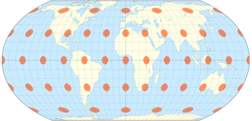
But perhaps the most ironic criticism of all is the one that focuses entirely on the projection chosen by Peters. Of all the equivalent projections he could have stolen designed, he picked one of the few that significantly distorts the entire map, except for Europe, North America, and Central Asia. These are precisely the regions he accused of colonialism and Eurocentrism.

If you look at the map above, although the projection maintains the area at all latitudes, the only latitude that keeps the shapes intact is the one marked in orange, the 45° north and 45° south parallels. Despite criticizing Eurocentrism, Peters had ensured, voluntarily or involuntarily, that his native Germany was not altered by the same distortions as Africa or South America.
In the scientific and cartographic fields, the projection ended up being named Gall-Peters, which at least gives credit to the true creator of the projection. However, it also gives questionable credit to Peters, who did not even know how to draw the map correctly according to his definition of the projection10.
Although Peters did not profit directly from this map and projection, at least not in any known way, all this allowed companies such as ODT Maps to sell up to 80 million copies. Many of those maps were sold to various NGOs and governments, after convincing them through their propaganda that they were buying a correct representation of the Earth.
Correct the map
And after all this background, let's return to the original story I started with today, the Correct the Map campaign.
To do so, let's go back to 2017, when the Boston Public Schools decided to adopt the Gall-Peters projection as the reference map in their partner schools. This prompted Tom Patterson11, Bojan Šavrič, and Bernhard Jenny to start working on a new projection that not only had a good balance between all the features we have already seen (area, distance, and shapes), but was also aesthetically appealing. This is how the Equal Earth projection was born in 2018.
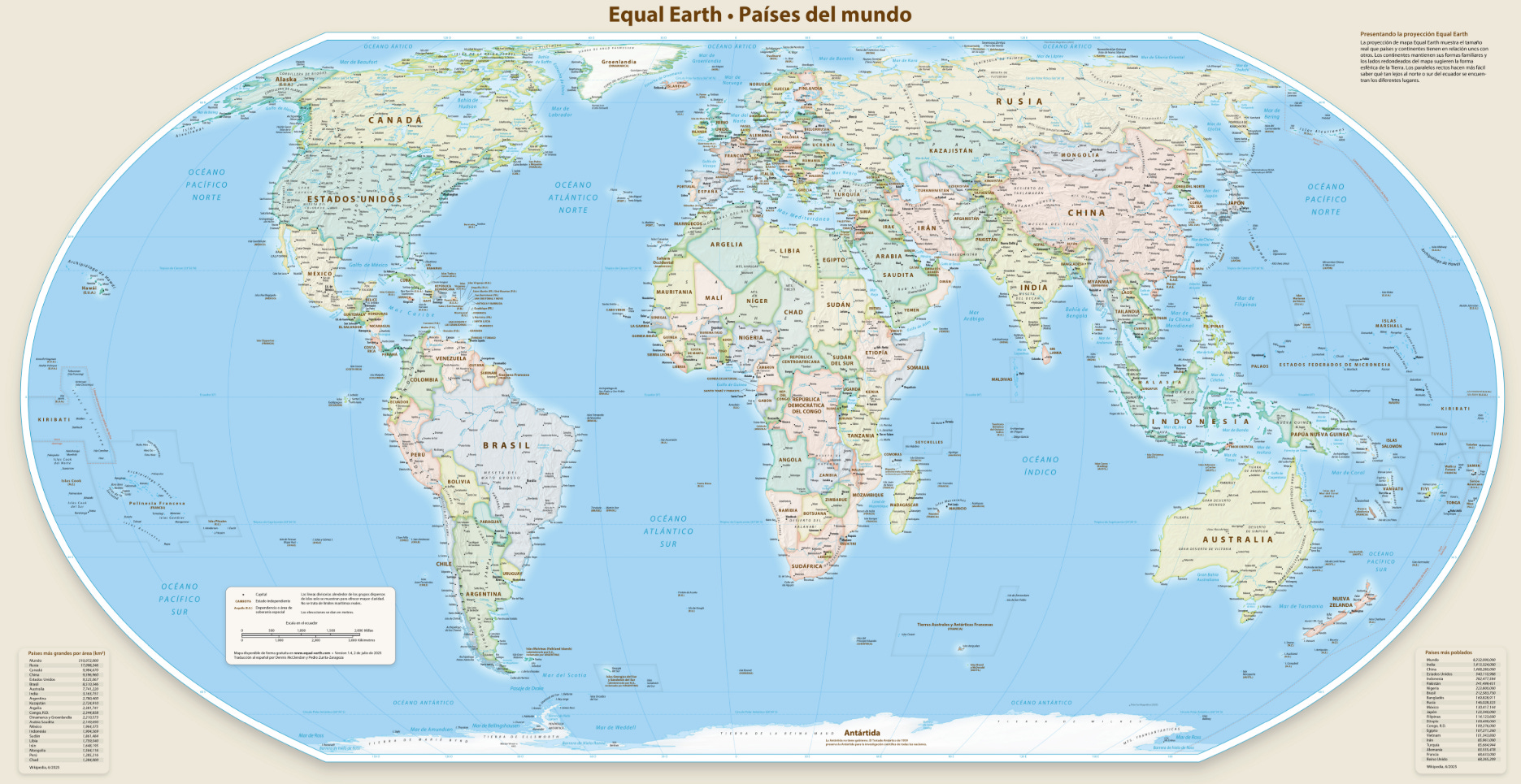
I think this project is truly wonderful. All the content is published in open-source code, so you can download any map and print it without having to pay anything. In addition, the authors provide different maps centred on four different meridians, and two additional ones with north at the top. All of them can be downloaded in 15 different languages, and you can choose between the physical and political versions.
It contains more than 2,600 labels, and so that everyone can change the details they deem appropriate, the files are also available in Adobe Illustrator.
Most importantly, it strikes a good balance between the shape and size of the different countries.
In general, Equal Earth can be said to be the first open project that truly proposes an alternative to the education system.
Seven years later, in January 2025, the Correct the Map campaign emerged. Once again, it originated as a criticism of the Mercator projection and the display of power it exerts over continents such as Africa, which is systematically underrepresented in this projection. And this campaign, as Peters did half a century ago, categorically reaffirms that this map, Equal Earth, is the true representation of the Earth, the correct one.
And that is precisely where my problem lies. I am the first to argue that, in education, in newspapers and magazines, and in general, the cartographic projections used to represent the world map should be a good compromise. I think the Equal Earth projection is an excellent compromise. But as a cartography enthusiast, it pains me deeply every time someone talks about the “true” map, the “correct” map, or that the Mercator projection is “wrong.”
I will never stop loving this scene from the West Wing of the White House, but please don't say that any map is right or wrong simply because of the projection it uses. We should just focus on saying that some projections are more or less suitable for different purposes, but we have to avoid sensationalism.
Well, to finish up, I'll leave you with this meme that any map lover will appreciate. If you didn't know it, you'll probably save it.

By popular demand, here’s a button for procrastinating, in case you have plenty of things to do, but you don’t feel like. Each time you click on it, it will take you to a different map from the more than 1,100 in the catalogue.
If you like what you read, don’t hesitate to subscribe to receive an email with each new article that is published.
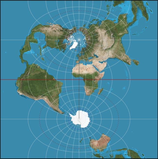
The sphere is a non-developable body. If you want more details, here is the complete mathematical explanation.
Although there are also ancient references to it in China.
75° latitude is extremely north or extremely south. Well beyond Norway or mainland Canada in the north, in the middle of Antarctica in the south.
He was the first person to prove that π is an irrational number. And Lambert surfaces are named after him.
Yes, it looks very similar to the one that Gall and Peters would later popularize. That’s the reason I picked this particular one.
This Wikipedia article lists up to 26 equivalent map projections.
This is highly questionable, as much of his criticism claims to have thoroughly studied all previous cartography.
When he first presented the map, he used the 46.02° parallels as a reference instead of the 45° parallels. This error led many people to claim that Peters actually arrived at the same projection as Gall independently. I still find this to be highly questionable evidence.
Tom Patterson is the cartographer behind the projection itself. He is a great cartographer who has already appeared in the map catalogue.
Gran artículo, felicidades por salir en flowingdata por cierto
Tsk-tsk. The correct map _for what?_ is always the cartographer's question. The rest is just projection.