

Maps of the Month: May 2026
The most interesting maps and articles I came across in May 2026

May has arrived in Spain with a vengeance. As well as the usual pollen, to which I’m very allergic, the high temperatures have also come. And of course, this is a problem for me: if I go outside, the pollen makes my life a living hell, and if I stay indoors with the windows shut, the heat makes my life a living hell. Perhaps the strangest thing is that, despite this dichotomy, I still love this time of year. That said, I’ll enjoy the weather even more once the pollen peaks are over.
While I wait, here’s the latest instalment of the maps of the month. Here’s what you’ll find in this edition:
Hantavirus aboard the MV Hondius
Global dependence on tourism
Heat map of Spain
At what temperature does it start to get hot?
Cities on the same parallel
The Chernobyl Atlas (1996)
Another way of looking at Australia’s population
The map that solved the mystery of Villa Farnesina
The Tuareg and the offensive in Mali
The ravages of palm oil in Indonesia and Malaysia
Hantavirus on board the MV Hondius
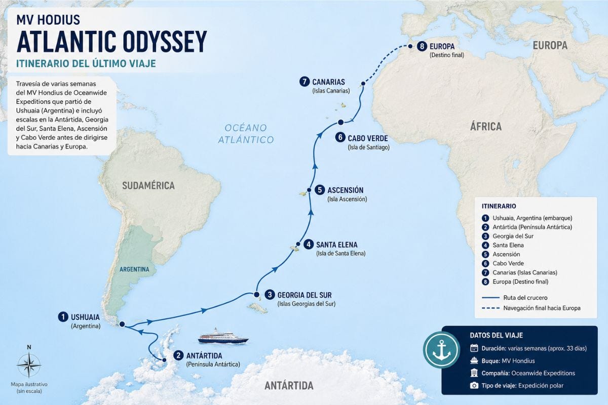
On 1 April, the MV Hondius set sail from Ushuaia, in Argentina, to visit Antarctica and several islands in the South Atlantic. Just ten days later, the voyage took a turn for the worse when one of the passengers died. On 22 April, 28 passengers disembarked at Saint Helena, intending to end their journey, whilst the rest continued on to Cape Verde. On 2 May, the World Health Organisation received a report: there was an outbreak of hantavirus on the MV Hondius, and three people had already died. Two had died on board and the third in Johannesburg, one of those who had disembarked at Saint Helena.
The expedition ship docked in Praia, the capital of Cape Verde, a day later, but no passengers were allowed to disembark due to the lack of guarantees that the disease could be contained. And then the international media picked up the story. As shown by the Forbes map above, the MV Hondius continued on to the Canary Islands, Spain, where an operation was mounted to disembark and evacuate all passengers to their respective countries.
Despite the media coverage, misinformation and understandable initial fear, it can be said that the containment of the outbreak has been a success. The hantavirus is not new; it is a known virus, although there have been few documented cases of human-to-human transmission. What has been documented to an extent rarely seen before is every single case in great detail, which has enabled the creation of interactive maps such as this one.
The world’s dependence on tourism

The MV Hondius, as well as being the vessel linked to one of the WHO’s most recent outbreaks, is also an example of the global reach of tourism. Over the last 25 years, international tourism has more than doubled, rising from around 700 million international travellers to 1.5 billion. As we all know, this tourism is not distributed equally across every corner of the globe, with some countries bearing a heavy burden as a result.
A heavy burden, but also a heavy reliance. The map above shows each country’s dependence on international tourism as a percentage of GDP. Destinations with over 50% include small and rather exclusive places such as Andorra, Aruba, the Maldives, and the Seychelles.
The map only reflects international tourism receipts, which explains why the United States sits at just 0.7% of GDP; even so, when domestic tourism is included, this figure rises to 8.6%. Something similar happens in China, where international tourism accounts for only 0.3%, but with domestic tourism included, the figure rises to almost 10%1.
Heat map of Spain
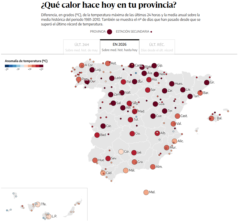
The fact that Spain is a major tourist destination has always been seen by Spaniards, myself included, as both an honour and something of a double-edged sword. It’s fine that people appreciate everything Spain has to offer, but at the same time, people wish it didn’t have such an impact. That said, the good weather and the beaches ensure that tourism skyrockets every time the good weather arrives. Mind you, this year we’ve had more than our fair share of heat. Much more than usual.
The map you can see above is taken from an interesting article in the Spanish newspaper El Diario, which explores just how hot it is in 2026 compared to other years. And the data is overwhelming. Average maximum temperatures this year are exceeding two, and in some cases even three, degrees at many of the country’s weather stations. And it’s not simply a warmer year; it’s a trend that seems unstoppable.
Along the same lines, I saw a brilliant chart by Dominic Royé on LinkedIn showing the temperature records that have been broken in Spain since 1950. Decades ago, both cold and heat records were being broken, but over the last forty years it seems that only heat records are being broken.
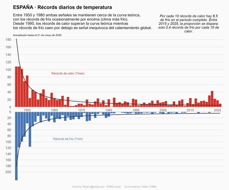
The reason is clear: it is getting hotter and less cold; the measurements don’t lie.
At what temperature does it start to feel hot?
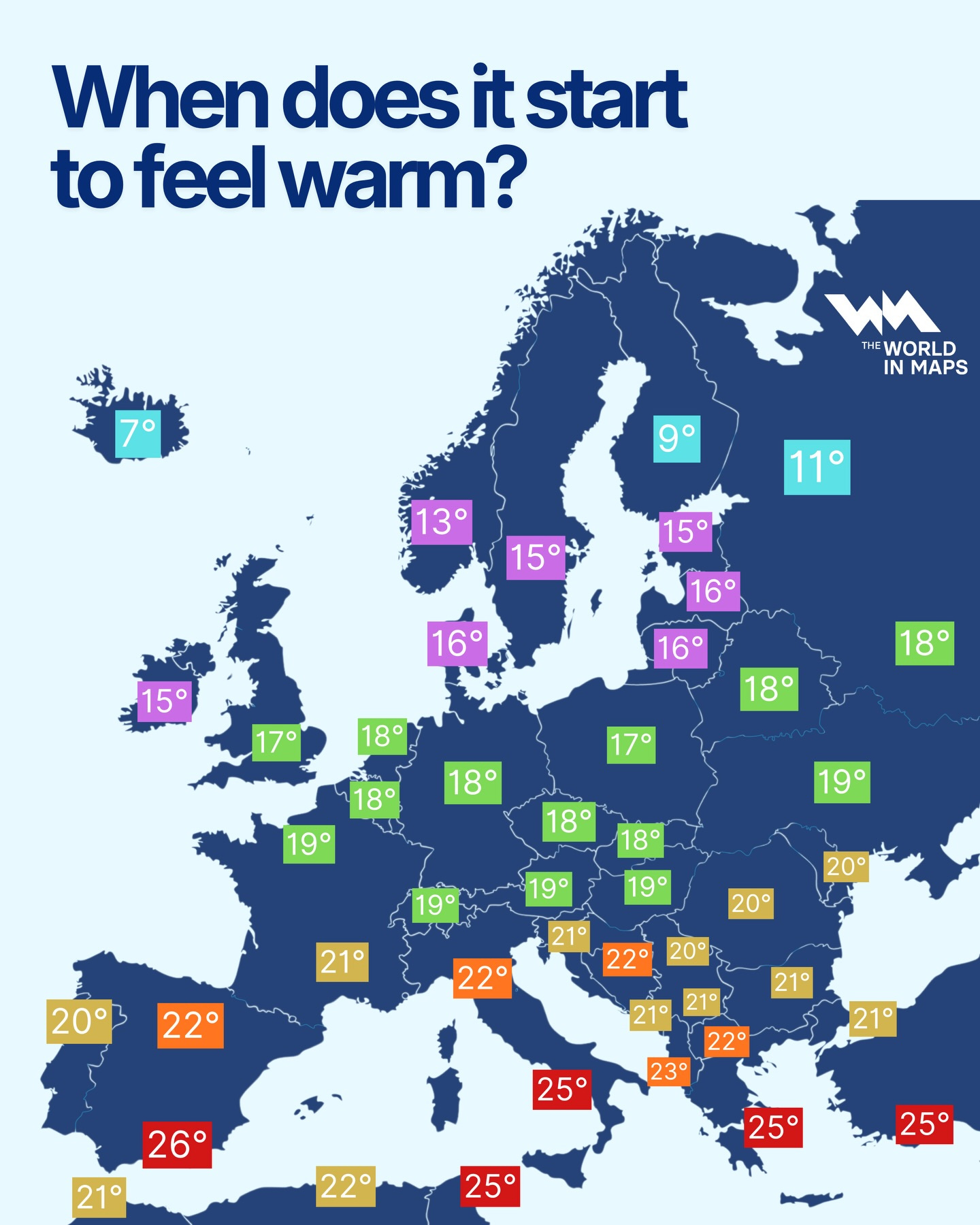
Another interesting topic we could discuss, along the same lines, is what we consider to be hot in different parts of Europe. Anyone from Southern Europe, such as Andalusia (Spain), Sicily (Italy) or Crete (Greece), doesn’t consider it hot until temperatures exceed 25 degrees Celsius2, whilst in countries like Finland or Iceland, even 10 degrees can be considered warm.
I’ve tried to find a reference for the data used by The World In Maps for the map I’ve included above, but I haven’t found anything. That said, I do think it highlights perfectly something we often overlook: human beings get used to temperatures and find it difficult to cope when they fall outside the ranges we’re familiar with. Much like what happens when heat or cold arrives out of nowhere: we simply don't like it.
Cities on the same parallel
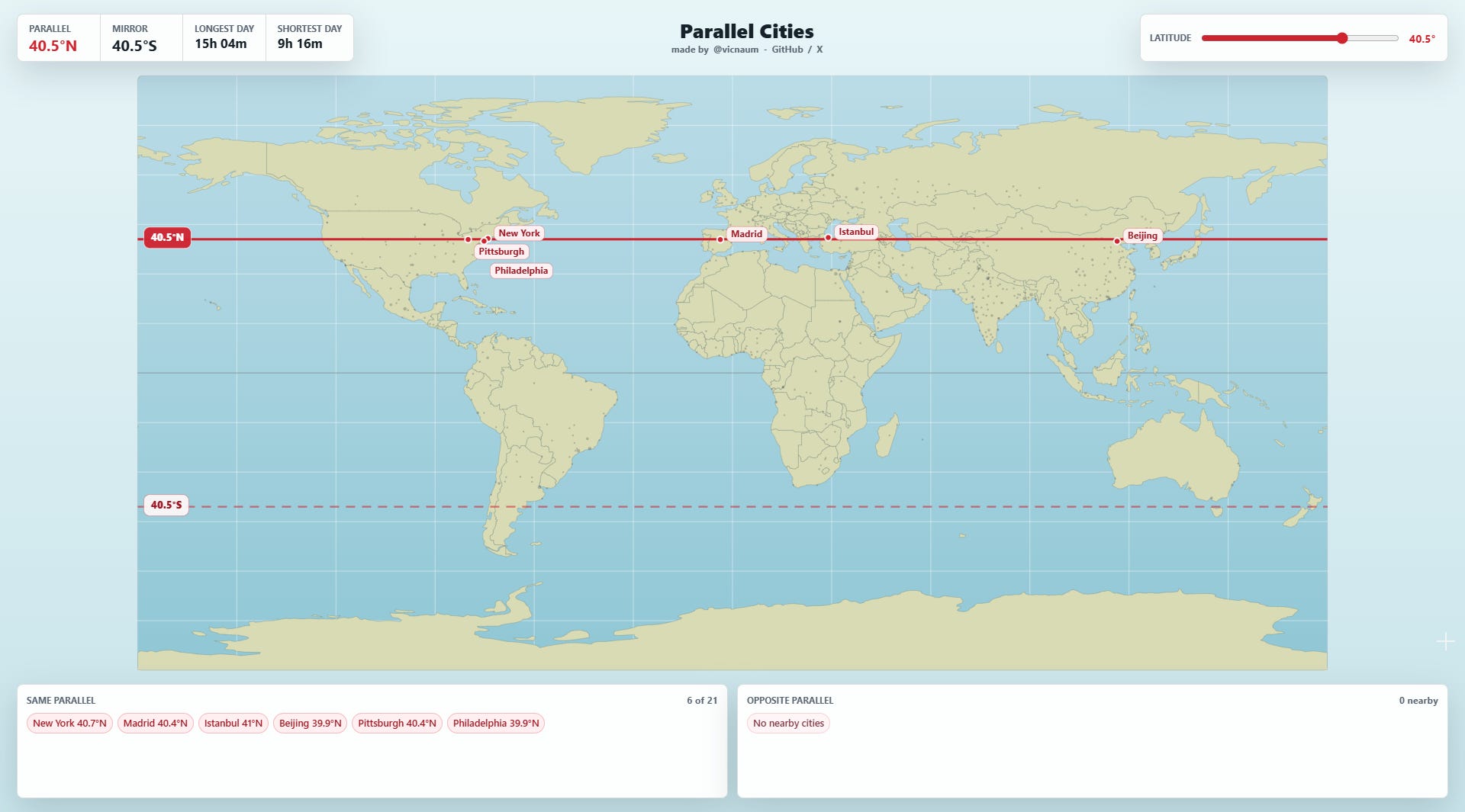
And following on from the previous map, I also thought it would be worth sharing this gem published by Convergence Boy earlier this month. It is an interactive map where you can see which cities are on the same latitude. There we can see that cities such as Istanbul, Beijing, New York and Madrid share the same latitude, just as Los Angeles and Tokyo do.
Because of global temperature patterns, we tend to assume that cities at similar latitudes share similar temperatures, but this is far from reality: due to altitude, ocean currents, proximity to the sea and the position of mountains, New York experiences heavy snowfall every year, whilst in Madrid, every snowfall is an extraordinary event3.
The Chernobyl Atlas (1996)
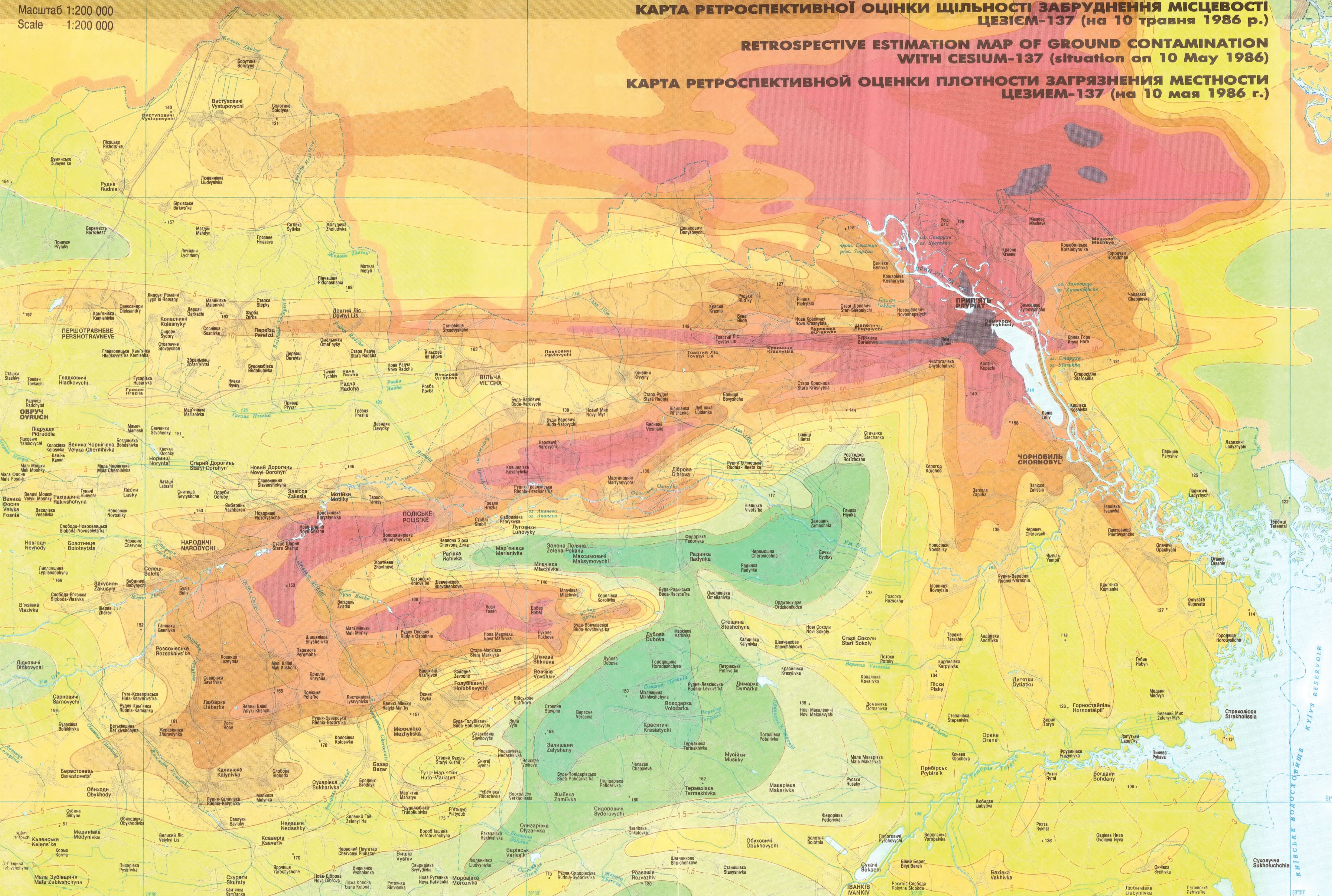
April marked the 40th anniversary of the Chernobyl accident, a catastrophe that redefined how the world viewed nuclear energy. A few weeks ago, Attila Bátorfy featured in his newsletter a magnificent atlas published ten years later, in the newly independent Ukraine, by Vyacheslav M. Shestopalov.
It is the Atlas of the Chernobyl Exclusion Zone, which was established as the first systematic attempt to map the radioactive impact of the explosion on the territory, wildlife, soil, and air. The map you see above, for example, shows the estimated soil contamination by caesium-137 following the accident.
Another way of looking at Australia’s population

Those of you who have been following this newsletter for a while will know: I like the many ways there are to represent population on a map4. Grid cartograms, such as this example of Australia, distort the geometry of the territory so that the area represented corresponds to a constant number of inhabitants5, 0.1% of the country’s population in this case.
Inevitably, this map of Australia is completely distorted, but it clearly shows the significant influence of the country’s major cities: Sydney, Melbourne and, to a lesser extent, Adelaide, Perth and Brisbane. And Canberra, the capital? There it is, right in the middle, and you can quickly see that it is a political centre, but not a city of great significance.
The map that solved the mystery of the Villa Farnesina
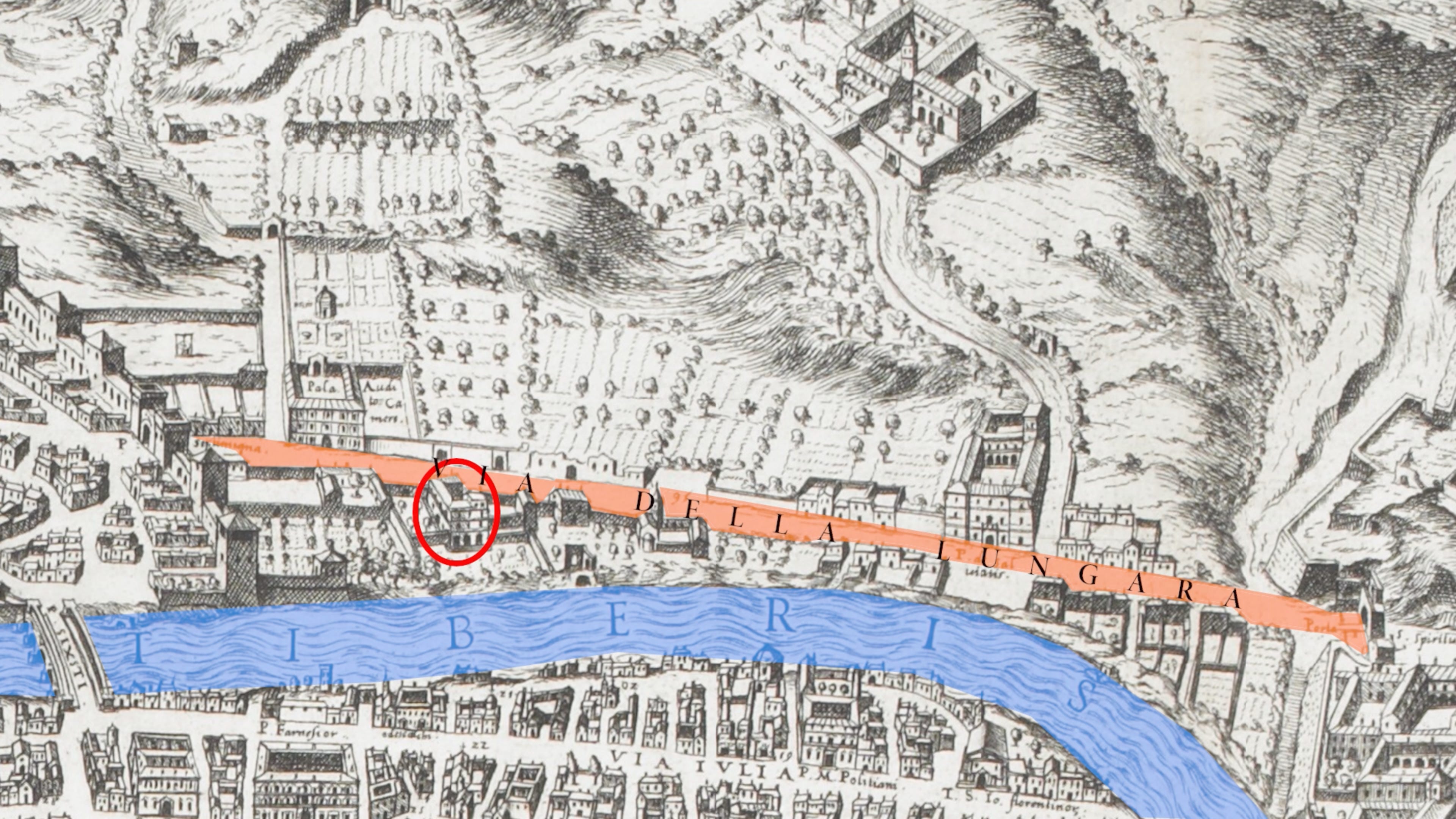
Howard Burton, the man behind Ideas Roadshow, published this excellent article a few weeks ago on Raphael’s fresco The Triumph of Galatea, which, unexpectedly, involves a good handful of ancient maps of Rome.
This fresco, located in Villa Farnesina in Rome, contained an inconsistency that art historians could not agree on. It features many aquatic motifs, and the Tiber was supposed to reinforce all these aquatic motifs, but from the Galatea room, where the fresco is located, the River Tiber cannot be seen.
Burton researched numerous maps of Rome until he came across the map you can see above, Étienne Dupérac’s 1577 map. It indicates that the room was originally an open loggia, which meant that from the Galatea Room one could see the River Tiber alongside the fabulous Triumph of Galatea.
The Tuareg and the offensive in Mali

The Tuareg are one of the world’s great peoples whose territory is divided among several countries. This map from the Spanish geopolitics outlet El Orden Mundial shows how they are spread across much of Niger, north-eastern Mali, south-eastern Algeria and western Libya.
Azawad, located in Mali, is a territory that declared its independence in 2012 following a Tuareg uprising. That uprising was opposed by the Malian government, which in turn had the support of French troops. Azawad did not succeed in gaining independence, but the Tuareg continue to actively fight for their territory and their rights. Since 2020, both the Nigerien and Malian governments have had the support of Russia, through the Wagner Group, in their struggle, but with ever-diminishing success.
The ravages of palm oil in Indonesia and Malaysia

To conclude, I bring you this watercolour map by Justine Vignat on the impact of palm oil cultivation in Indonesia and Malaysia. The extent of deforestation carried out to establish plantations is shown in red, whilst the small area of tropical forest that remains is marked in green.
Malaysia and Indonesia together produce 85% of the world’s palm oil, and it is precisely in these countries where the impact of these plantations has been most evident. And yes, this affects orangutans, among other animals.
By popular demand, here’s a button for procrastinating, in case you're looking for a distraction. Each time you click on it, it will take you to a different map from the more than 1,200 in the catalogue.
If you like what you read, don’t hesitate to subscribe to receive an email with each new article that is published.
Something interesting also happens in Spain, Italy, France, and Turkey. International tourism accounts for 6.2%, 2.5%, 2.4% and 4.4% respectively, but when domestic tourism is included, the figure soars to 12.6% in Spain, 13% in Italy, 10% in France and 12% in Turkey.
77 degrees Fahrenheit.
In Madrid, there was a snowstorm in 2021 that brought the city to a standstill for over a week. Around 50 centimetres fell, the same amount that might fall in New York in any given year whilst the city remains fully operational. That’s down to the Gulf Stream.
In reality, a grid cartogram can use any statistical variable. As this one deals with population, it uses a constant population figure.