

Maps of the Month: March 2026
The most interesting maps and articles I came across in March 2026.

We are still in the middle of an extremely busy year. Although only a quarter of it has passed, you’d think we’ve been in the muddy waters of 2026 for decades. And it doesn’t look like things are going to slow down. The good news is that the maps various creators are publishing or rediscovering are also keeping up the pace. That means we can bring you the latest instalment of the maps of the month without too much trouble.
Here is a list of what you’ll find in this edition:
The Strait of Hormuz
Israel’s plans in Lebanon
NATO map
The Blackout maps
Another way to represent election results
Neverland
Luxembourg is not a microstate
Child Penalty Atlas
The first flow map
How much sugar is in Fanta?
38 million escaped, 10 million died (1943)
The Strait of Hormuz
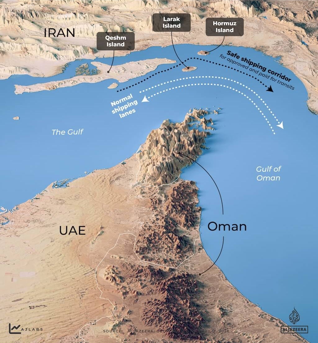
The war against Iran launched by Israel and the United States just over a month ago is still ongoing. Sadly, we may be getting used to the news, but the reality is that the escalation of violence shows no clear end in sight1. In the past weeks, almost all media attention has shifted to the Strait of Hormuz. 20% of the world’s oil passes every day through this stretch of water, 167 kilometres long and 39 kilometres wide. At least it did until Iran decided to close it a few weeks ago, reducing the number of ships from around 130 a day to barely 5 or 6.
Al Jazeera published a remarkable visual guide this March on the Iranian coastline, its strategic islands and the Strait of Hormuz. That is where I got the map you can see above, but I recommend you have a look at their website for more in-depth understanding of why this part of the world is so strategically important for the world.
Israel’s plans in Lebanon
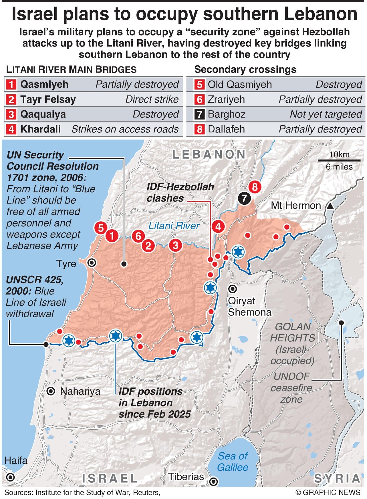
On 2 March, just two days after the war against Iran began, Khamenei’s death was confirmed. As a direct consequence, Hezbollah launched retaliatory strikes, turning southern Lebanon into a new front in the war. What began as an exchange of missiles has rapidly turned into a ground operation through which Israel seeks to occupy southern Lebanon, more specifically the entire territory south of the Litani River. Israel’s current objective is to shift the de facto border with Lebanon to the river.
The choice of the Litani as the border is no coincidence. UN Resolution 1701, adopted in 2006, already referred to this river, demanding that Hezbollah withdraw north of that borderline. Twenty years later, Israel wants to enforce compliance with that resolution and much more. It no longer seeks only for Hezbollah to disappear from southern Lebanon, but for hundreds of thousands of Lebanese to abandon their homes in the region so that it can be occupied by Israel.
All this is not mere speculation; Israel’s Finance Minister has already asserted that the country’s intention is to establish the new international border at the Litani River.
NATO map
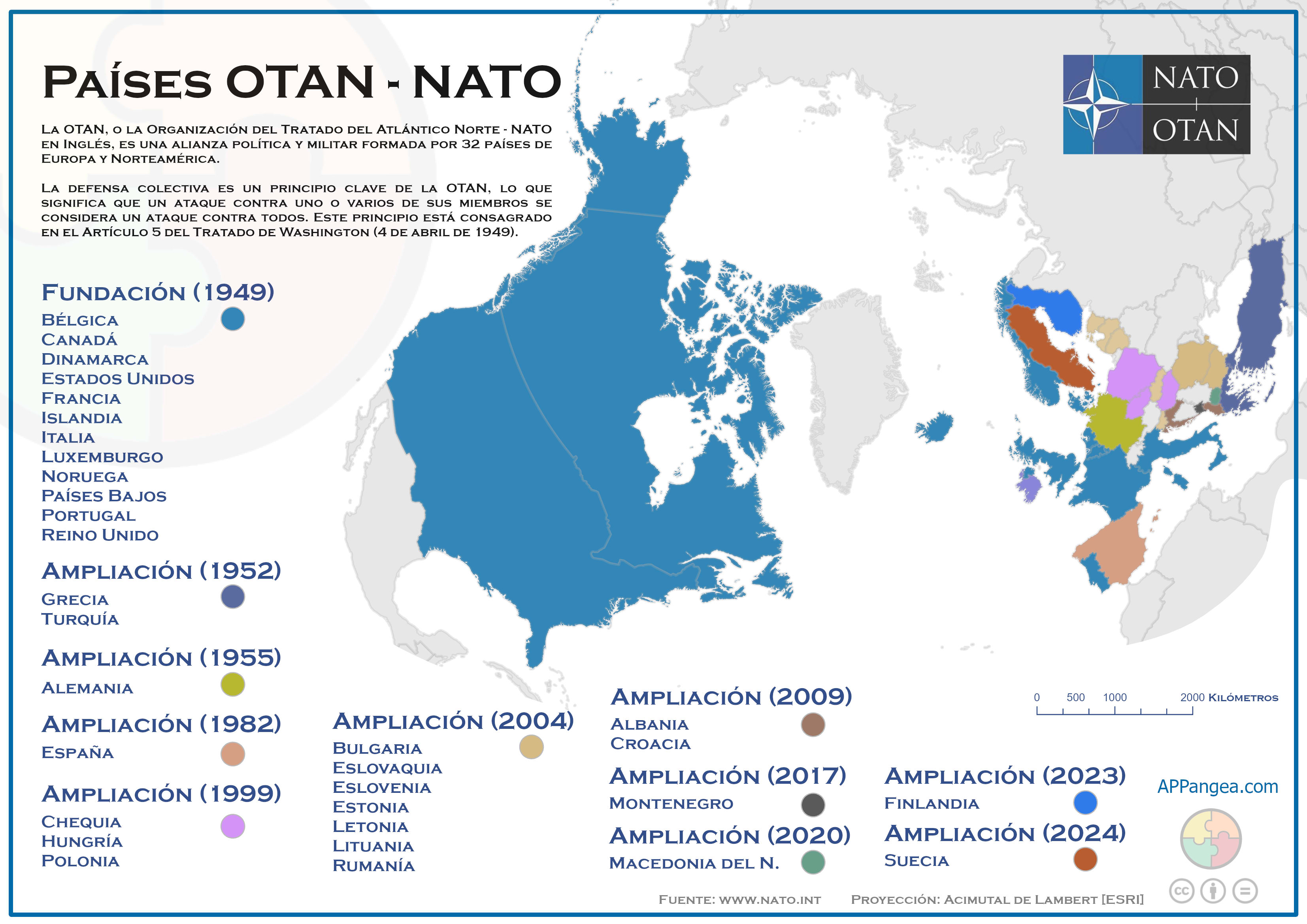
NATO is the West’s major military alliance. It was established in 1949 with 12 members, and over the decades has expanded to its current 32 members. Recently, and more intensely in past weeks, Donald Trump has repeatedly questioned the value of this alliance, as he does not feel the United States is receiving the support it needs. In response, many world leaders and media outlets have insisted that NATO is a defensive alliance. They reference that Article 5 is only relevant when a member state has been attacked, which is not the case in the war with Iran, initiated by the United States and Israel.
But I would like to take this opportunity to speak briefly about the first two articles that appear in the treaty before the famous Article 5, as I think we are overlooking the most fundamental aspect of NATO2:
Article 1: Members undertake to settle their disputes by peaceful means and not to threaten international peace.
Article 2: Members shall strengthen their free institutions and promote economic cooperation amongst themselves.
That’s right, NATO explicitly calls for the use of peaceful means, for international peace not to be threatened, and for economic cooperation amongst members. Trump is threatening to leave NATO because he mistakenly believes that the other members should support the United States in its war with Iran. What I believe is that NATO will be irrelevant as long as its most powerful member has not the slightest intention of complying with the principles of peace and cooperation.
The Blackout Maps
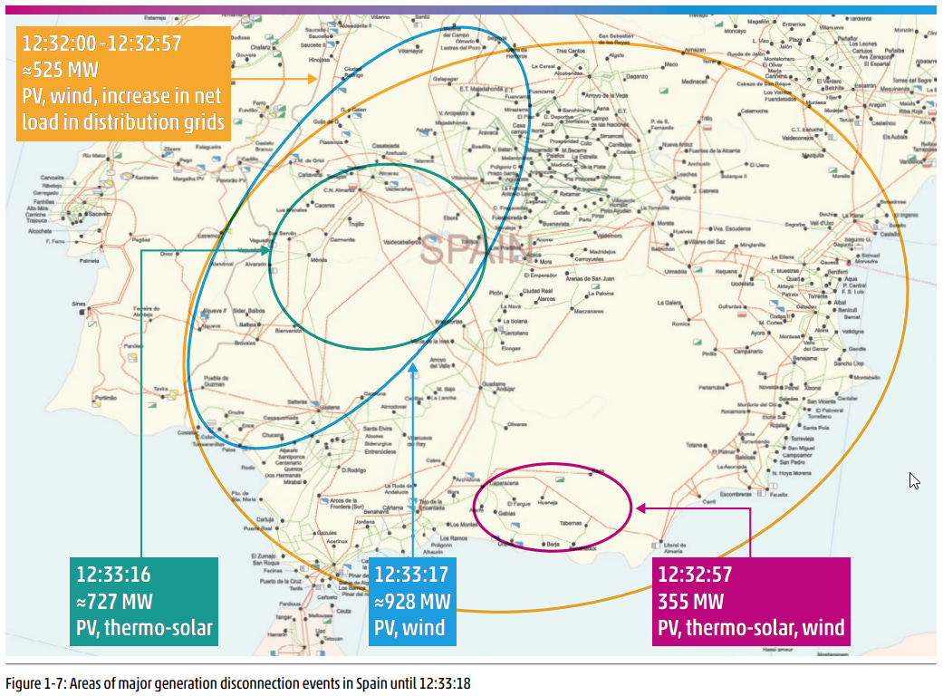
Almost a year after The Blackout on the Iberian Peninsula, we now have a detailed report on what happened. On 20 March, ENTSO-E published a 472-page report on the events of 28 April 20253. I have taken the map above from the report. It shows the four major waves of disconnection that occurred during the 90 seconds leading up to the collapse of the electricity grid.
The second map, which you can see below, shows the events of the following hours and the process of restoring the supply. Power returned to the country via the eastern Pyrenees, the western Pyrenees and the south. Successively, several substations were brought back online, whilst some also attempted to restart unsuccessfully (all purple circles) or successfully (green and blue circles).
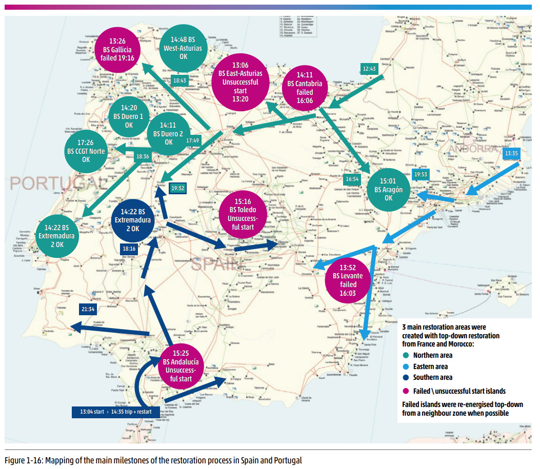
The report’s conclusion is more or less what many had been saying for some time. There was no sabotage, nor was there a single responsible. What there was, however, was a system designed for a different energy mix, which became destabilised until it reached the point of no return.
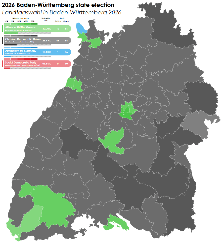
Another way of representing the election results
On 8 March, elections were held in the region of Baden-Württemberg, Germany. The map above shows the winners in each constituency, where we can see that the CDU won the majority of them, followed by the Greens with significantly fewer and Alternative for Germany with just one. But of course, this view is partially misleading, as the Greens secured the majority of the votes and the same number of seats as the CDU. Alternative for Germany, despite winning in only one constituency, also secured 35 seats, compared to the 56 held by the Greens and the CDU.
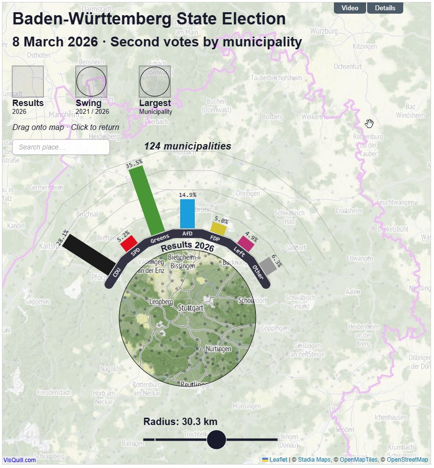
Election maps often have this problem: depending on how the information is displayed, it can lead to one set of conclusions or another. That’s why I really liked Benjamin Niedermann’s visualisation of these elections, which I discovered via the Nosolosig newsletter4. It is an interactive map that allows you to set a radius and visualise each party’s success in all the municipalities that fall within the circle. The experience is wonderful and helps you understand the distribution of votes much better than other classic electoral maps.
Neverland
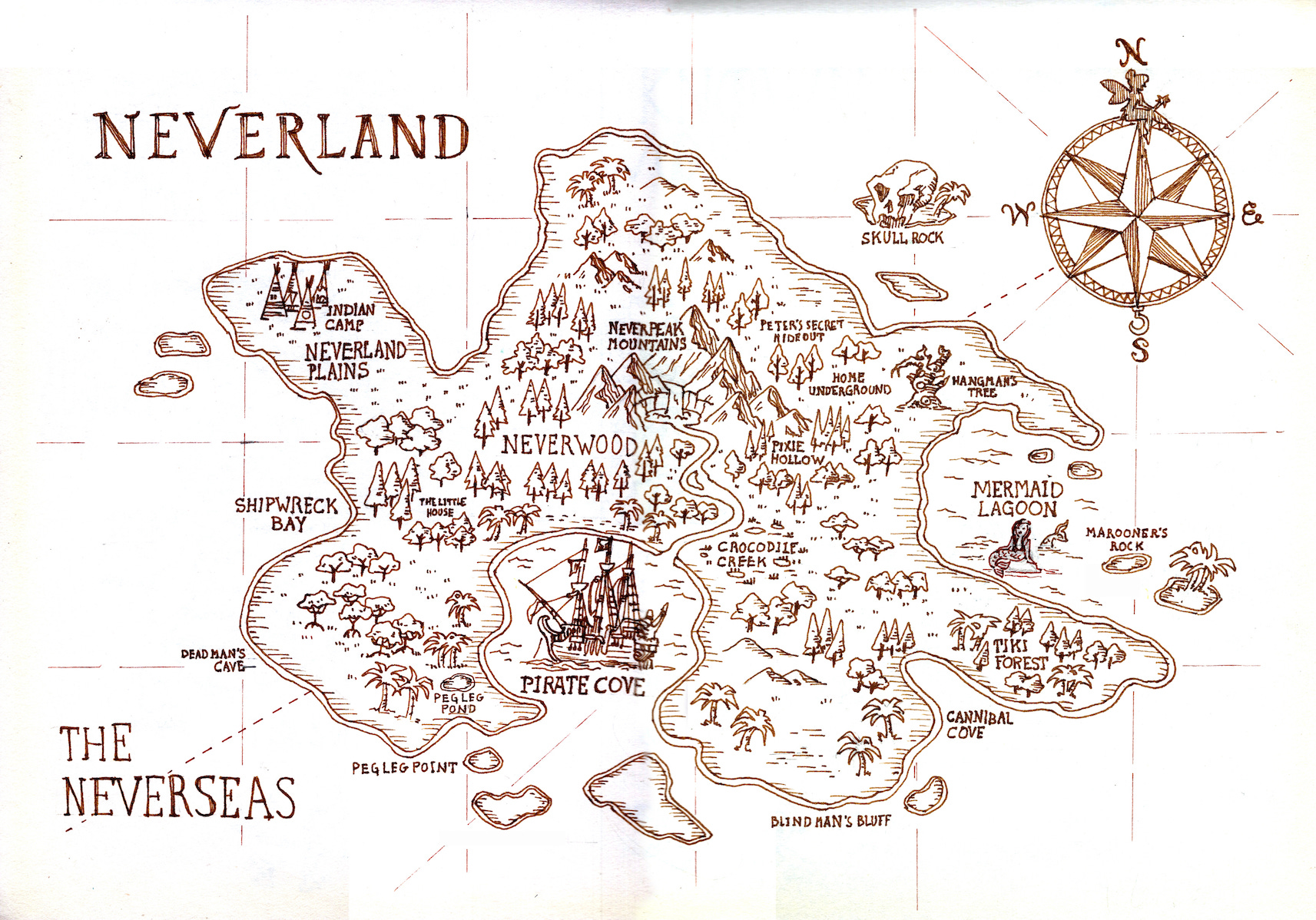
This map was published by Cristina in her newsletter5 and, as usual, it is absolutely marvellous. It is an analysis of the cartography of Neverland, covering both the location of Peter Pan’s island and the features of its interior geography. The story traces how all this was built up step by step, adaptation after adaptation.
As Cristina rightly says, Neverland is not a place that can be mapped in a single common way, since it is different in the mind of every child who reads the book. Even so, the map you can see above, also created by Cristina, is really lovely.
Luxembourg is not a microstate

People often refer to Luxembourg as a microstate. And yes, it is one of the smallest states in Europe, but globally it ranks 26th on the list of the world’s smallest countries. And here’s the point: true microstates are much smaller.
This map compares the size of Luxembourg with that of seven countries that are commonly referred to as microstates6: Singapore, Andorra, Malta, Liechtenstein, San Marino, Monaco, and the Vatican. Yes, all of them would fit inside Luxembourg and would only occupy about two-thirds of its territory.
Child Penalty Atlas
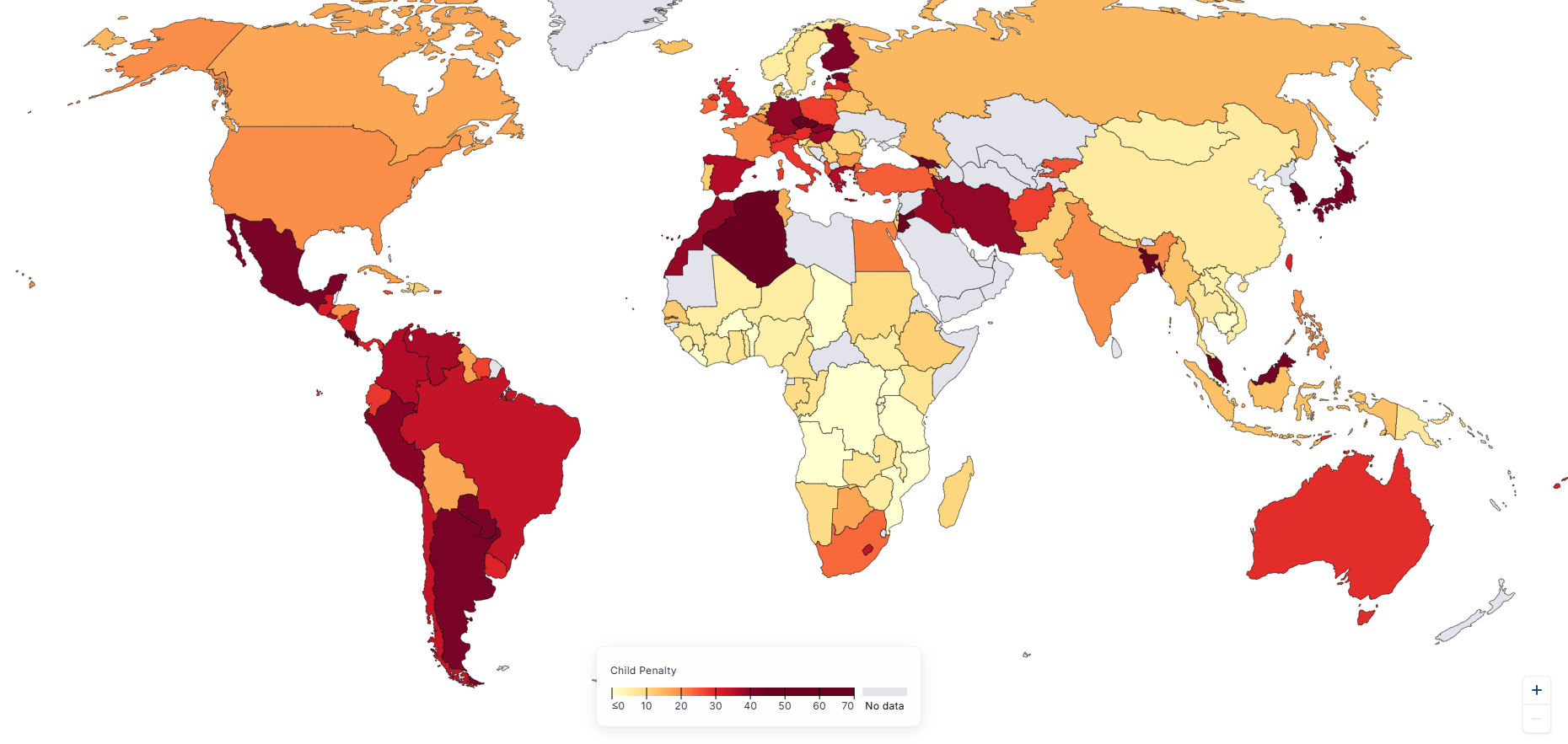
Much has been said on this subject, but it is important to emphasise it because it is far from being resolved. This is an academic project that explores the career penalty women face for becoming mothers. In other words, it quantifies how much women’s employment and income fall after having children.
It is clear that, broadly speaking, almost all countries perform poorly in this regard. The impact is limited only in parts of Africa, parts of Asia and Scandinavia, with appalling figures across almost all of Latin America, much of Europe and the Muslim world, as well as Japan and South Korea.
On the Child Penalty Atlas website, you can explore the various indicators interactively.
The first flow map
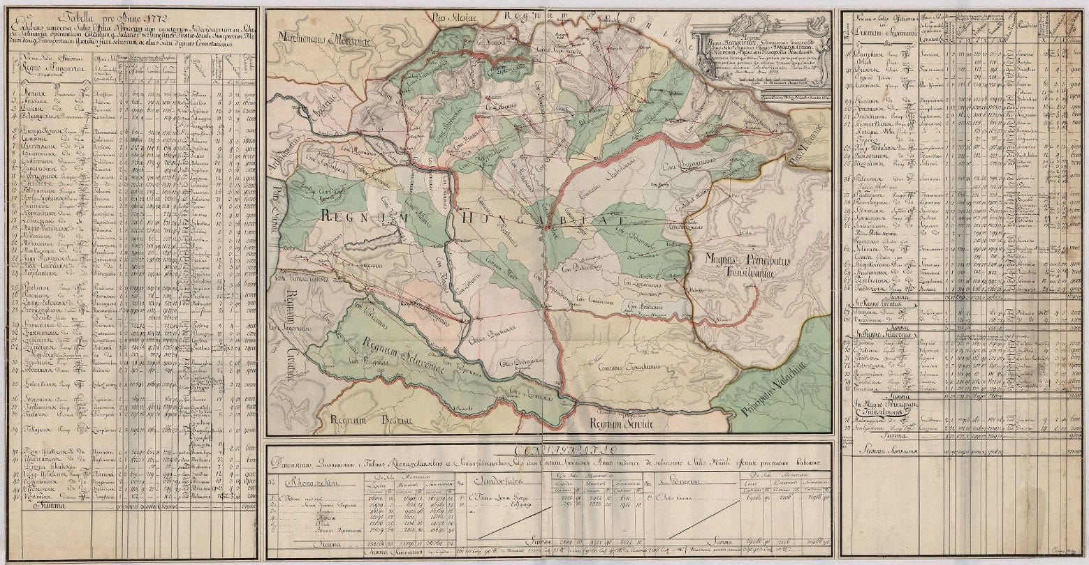
Until a few weeks ago, if you had asked me which was the first flow map in history, I would have said without hesitation that it was Henry Drury Harness’s map. More specifically, the map he published in 1837 on the transport of passengers and commercial goods in Ireland.
This March, Attila Bátorfy revealed to me that Harness was not the pioneer either, but that honour should go to Imre Milecz, the author of the map you can see above. In this article, you can explore this important piece of Hungarian cartography in detail; it goes far beyond being a map of the routes and volumes of the salt trade in the Kingdom of Hungary in 1773, and opens up an interesting debate about the first flow map.
How much sugar is in Fanta?

This March, I’ve also decided I need to eat a bit better7, so I’ve been reading quite a bit about nutrition and things I should avoid. One of the hardest things is figuring out which drinks are best to have when you go out at the weekend. I don’t mind drinking water and sparkling water, but it can get a bit repetitive. I want to avoid alcohol, but I can’t exactly consume all the sugar in the world either… and almost all drinks are packed with sugar. Have you ever noticed how much sugar there is in non-alcoholic beer?
In this context, a week ago, I came across the map you can see above, which shows the amount of sugar in a can of Fanta in different countries. I thought it was already excessive in Spain, but when compared with the rest of Europe (and the United States), it seems like nothing. Watch out for the United States, Italy or Belgium.
38 million escaped, 10 million died (1943)

To finish off, I’ve included a map that I uploaded to the catalogue last month and which I consider a true masterpiece. It is a propaganda map simulating the impact that Operation Barbarossa would have had on the United States. The Soviet territory occupied by Nazi Germany in early 1943 is shown in brown, and various American cities are matched with their Soviet counterparts.
The aim was to generate empathy with the cause to secure support in the United States for participation on the European front of the Second World War. An empathy that, little by little, eventually worked.
By popular demand, here’s a button for procrastinating, in case you have plenty of things to do, but you don’t feel like. Each time you click on it, it will take you to a different map from the more than 1,200 in the catalogue.
If you like what you read, don’t hesitate to subscribe to receive an email with each new article that is published.
I hope I’m wrong, but I doubt it.
Just a brief summary of both articles listed, you can check the full details here.
The newsletter is published in Spanish, but extremely recommended if you are comfortable with the language and love GIS and maps.
The article is in Spanish, but it’s worthy to check it (even if you need to translate it with Google or a similar service).
It is common practice, when discussing microstates, to use an area of less than 1,000 square kilometres as a reference. Luxembourg has an area of over 2,500 square kilometres.
Actually, the doctor has decided for me, but I have to listen to him.
As for drinking... can I suggest green tea, including various flavours that can be added such as mint, lemon or jasmine - many more available. Much lower in caffeine - I have cut my coffee to two drinks before 9am and the rest of the day green tea in various guises. I sleep much better now.