

Maps of the month: February 2026
The most interesting maps and articles I came across in February 2026.

Lately, the pace of news and events has been increasing at a dizzying rate. As I mentioned last month, it seemed that the year had started off with a bang, but the second month has been even more eventful. And not necessarily in the most positive way possible.
Be that as it may, let’s begin with the new edition of maps of the month. Here is a list of what you will find in it today:
The United States and Israel attack Iran
Iran’s response
Disruption of international air traffic
Pakistan attacks Afghanistan
The Jalisco New Generation Cartel
Map of Mexican cartels
Panoramic view of Cortina d’Ampezzo
Population density in the European Union
Equatorial Guinea is not on the equator
The CIA’s World Factbook closes
Tintin’s Australia
The United States and Israel attack Iran
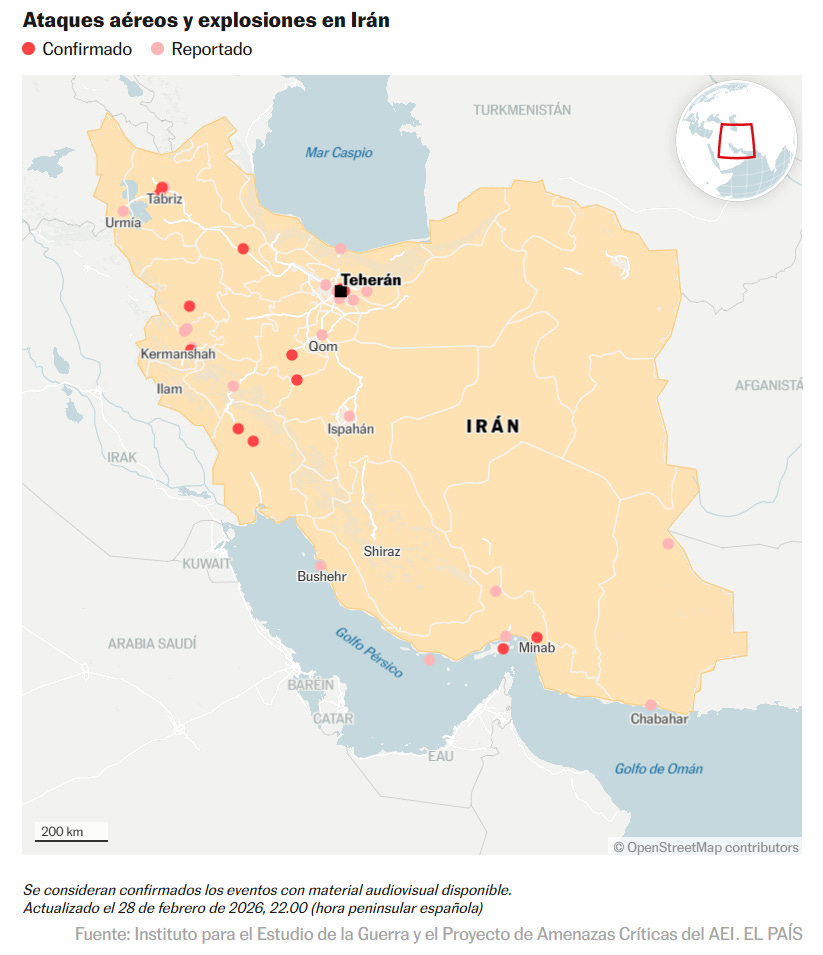
Perhaps the most surprising news of the month came on the very last day. On 28 February, the United States and Israel decided to attack Iran once again, as Israel did on 13 June. This time it was more than a surgical operation, like Israel’s last June, and sought to attack the Iranian regime directly, including military and political structures. The map shows the confirmed and reported attacks during the first day with red dots. Now the attacks are much more numerous.
I insist on what I have said before: no matter how you look at it, this is once again a violation of international law. Independently of how despicable Ali Khamenei and his way of governing Iran may be, international law does not allow this type of interference. The worst thing is that our current leaders1 are getting us used to this type of action. But if they succeed in normalising it, one day it could affect us more closely than we can imagine.
Incidentally, once again Trump has embarked on this adventure without the approval of the US Congress.
Iran’s response
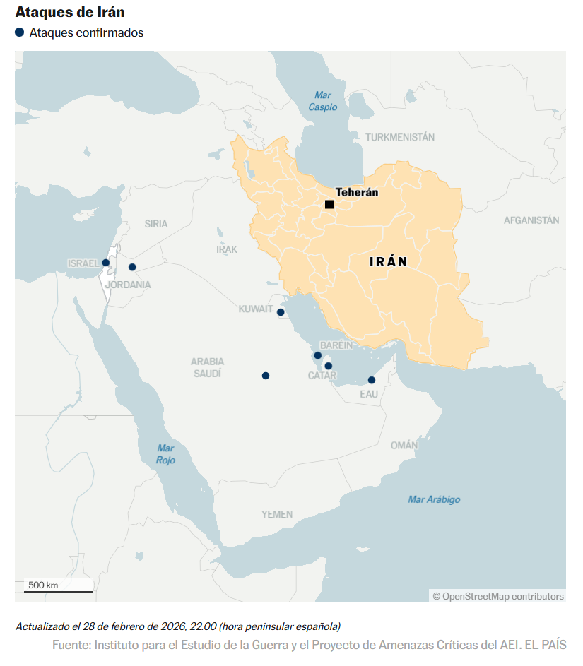
As expected, Iran has not hesitated to respond and attack Israel and all US positions in the region. Less than three days have passed since the escalation of violence began, so we are completely unaware of the full extent of Iran’s actions in the Middle East. What we do know is that at least three civilians have been killed in Dubai by debris from intercepted Iranian drones, prompting a warning from the United Arab Emirates that it could retaliate against Iran.
The map shows the attacks that had been confirmed on the evening of the 28th with blue dots. Two days later, Iran’s retaliation has also spread to Oman and Cyprus, the latter in retaliation against the United Kingdom for its support of the United States and Israel.
The United States and Israel’s attacks on Iran continue at this time, despite the confirmed death of Ayatollah Khamenei. Iran’s responses also continue. Yesterday, Trump claimed that there are already successors willing to negotiate an end to the missile exchange, but today the successors have openly said that they are not really interested. And yes, hopefully the hostilities will stop soon. But at this point, I can’t help but wonder what the next target will be, where international law will not matter in the slightest.
Disruption of international air traffic

As is often the case in these circumstances, international traffic has been completely disrupted. The map above is a screenshot from Flight Radar2 taken a few hours after the Israeli and US bombings of Iran. It clearly shows how Iran had closed its airspace, forcing airlines still flying over Iran to take other routes.
But a day later, with Iran’s response, the disruption to airspace is even greater. Three of the world’s major international airports, connecting Asia with Europe, were closed: Doha, Dubai and Abu Dhabi.
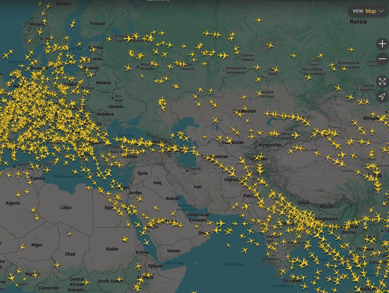
You can see yesterday’s map above. The closure of Iran’s airspace is compounded by air traffic restrictions in the Middle East. On top of all this, there are the restrictions that already existed, such as the closure of Ukrainian airspace and the fact that almost no European airlines are allowed to fly over Russia.
The result: an aircraft corridor has been created across the Caucasus, flying over one of the most unstable regions in recent decades. Who would have imagined this 20 years ago? Certainly, not me.
That said, I admit that I am now rethinking the holiday I had planned to Asia in the second half of the year. I am a little reluctant to experience this instability first-hand.
Pakistan attacks Afghanistan
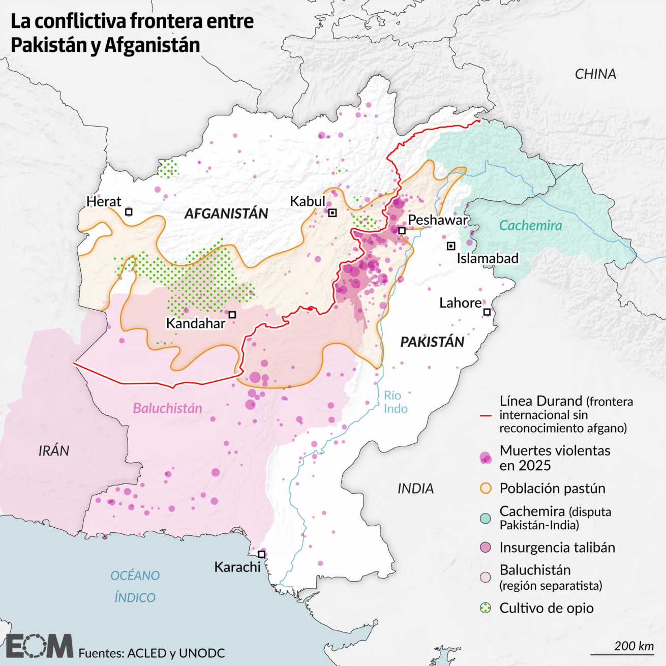
As if all this were not enough, we continue to see more conflicts escalating. With the pace of events, it seems like weeks ago, but only three days have passed. On 27 February, Pakistan launched a series of air strikes against Afghanistan and, after decades of continuous clashes, finally declared open war.
This conflict, to put it simply, has its origins in the British colonial era and the drawing of the Durand Line in 1893. That line was simply intended to mark the boundary of British colonial influence, but it is a border that has crystallised over more than 100 years as the border separating Pakistan from Afghanistan. The problem? Well, as the map above shows, this border divides the Pashtun people in two, which is why Afghanistan has never recognised it.
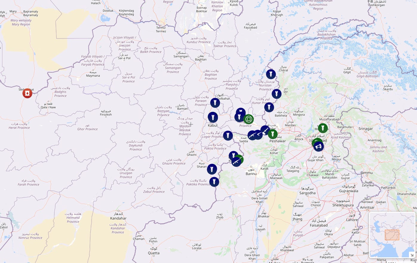
On this interactive website, you can follow the escalating events and the actions being taken by both Afghans and Pakistanis. I would like to believe that this will be short-lived and that everything will soon return to normal, but the concern is that normality along that border has been conflict for decades.
The Jalisco New Generation Cartel
The map above was published by InSight Crime and shows the area of operation of the Jalisco New Generation Cartel, one of the most important cartels in Mexico lately, thanks in part to the leadership of El Mencho. His influence was such that the United States had him listed as one of the main culprits of the fentanyl crisis, for which there was a $15 million bounty on his head.
With this context, it should not be surprising that a week ago, on 22 February, in an operation led by the Mexican government with the cooperation of US intelligence, El Mencho was killed. What few expected was the worrying wave of violence that broke out in the days that followed, as this left a significant power vacuum in a country, Mexico, where cartels still wield considerable influence.
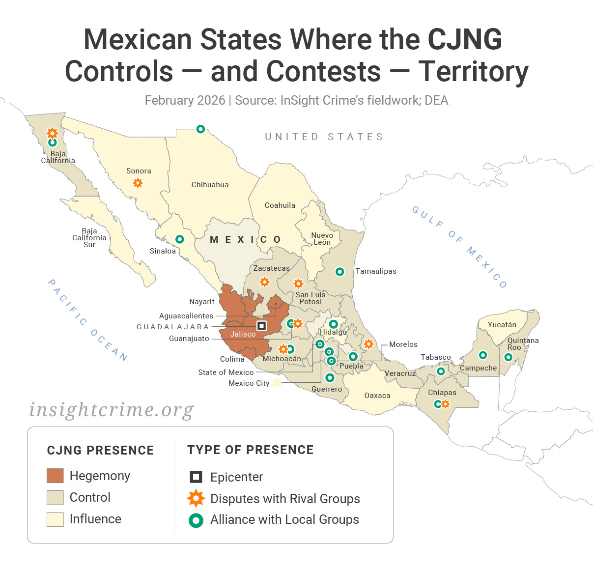
Map of Mexican cartels
")
While we are on the subject of Mexican cartels, I would like to share this interesting map that Ioan Grillo published a couple of years ago in his newsletter. It shows the main Mexican cartels and their main areas of influence. Among them, the main cartels stand out, such as Sinaloa (in red), Jalisco Nueva Generación (in blue) and the Juárez Cartel (in yellow).
Of course, many of these cartels have disputed areas and do not have the same level of hegemony in all of them. As if that were not enough, it is also important to understand that this is a very changing context and, worst of all, a tremendously violent one. Since 2007, when Mexico reached its lowest homicide rate, with 8 deaths per 100,000 inhabitants, this number has only grown, remaining above 25 homicides per 100,000 inhabitants since 20173.
That’s a shocking 25,000 people a year.
Panoramic view of Cortina d’Ampezzo
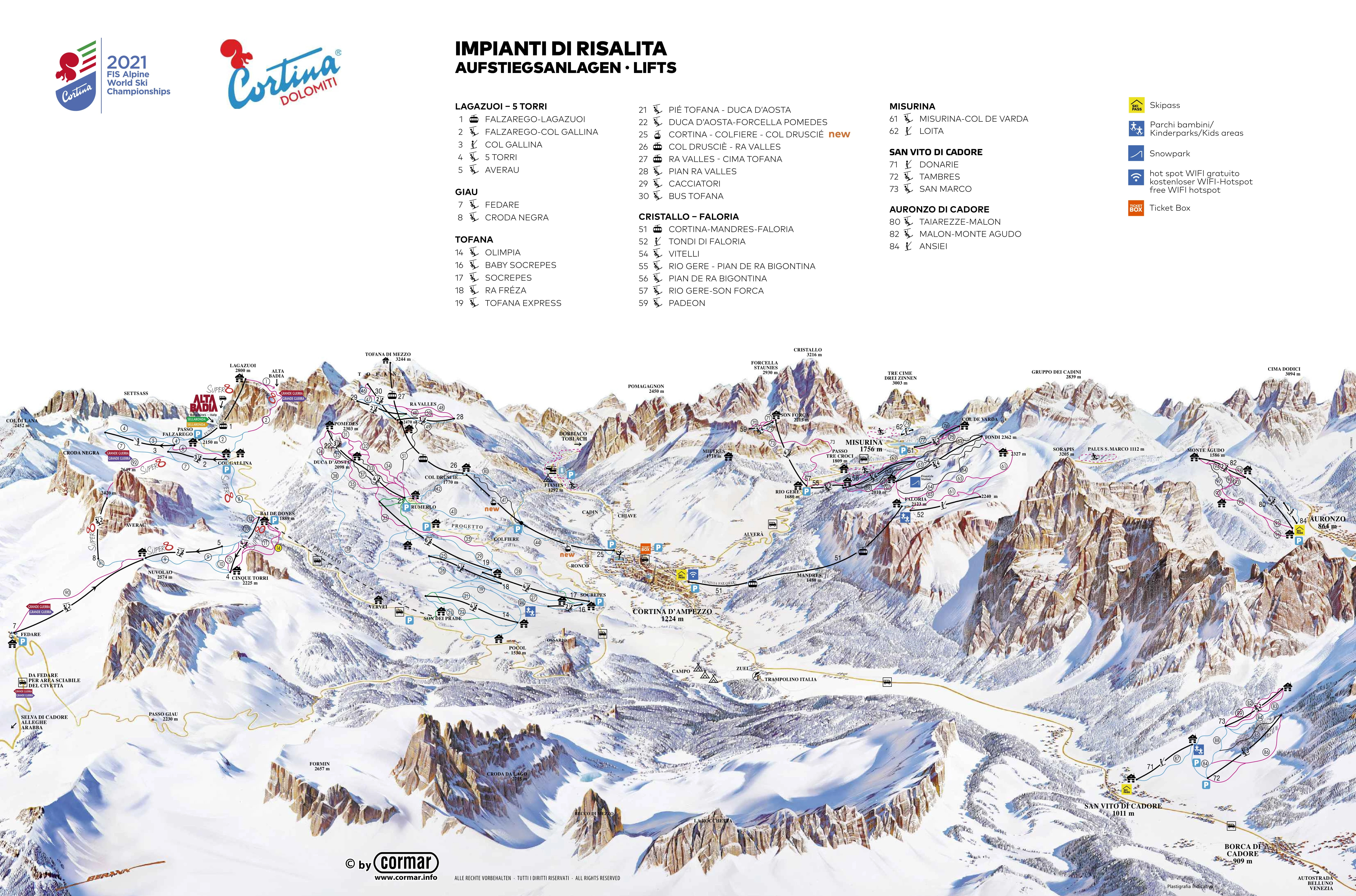
Changing the subject slightly, I also bring you this interesting panoramic map of Cortina d’Ampezzo, one of the venues for the Winter Olympics held this February. I saw the map on Doug Greenfield’s newsletter and I think it’s absolutely wonderful.
This beautiful panoramic image combines the local geography with a colour-coded map of the means of transport and the different ski slopes available at this resort. This resort alone has more than 120 kilometres of skiable terrain, but the Dolomites, where Cortina is located, have more than 1,200 kilometres of skiable terrain within relatively short distances.
Population density in the European Union
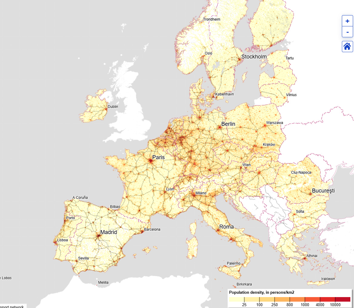
You may be surprised that I am showing you a map of population density in the European Union4, as these maps are often extremely hackneyed, but this one is highly recommended. It is an interactive map that I first came across last month, and I spent a good while browsing it.
I particularly like its level of granularity, allowing you to see the population in each square kilometre of Europe. Thanks to this, you can see the large empty spaces in Spain, Scandinavia, and the Alps, where there are many continuous square kilometres of white space, as they are not inhabited by anyone at all.
Equatorial Guinea is not on the equator
")
This map is one of those that lead you to think that you have been fooled.
As you can see on the map, there are only 13 countries in the world that are crossed by the equator: Ecuador, Colombia, Brazil, São Tomé and Príncipe, Gabon, Republic of the Congo, Democratic Republic of the Congo, Uganda, Kenya, Somalia, Maldives, Indonesia, and Kiribati5.
Do you notice anything peculiar about this list? That’s right, Equatorial Guinea is not on the equator. In fact, it is located completely north of the equator.
Yes, you have probably been fooled too. I was definitely not aware.
The CIA’s World Factbook closes

Although I said I didn’t want any more negative news, I think it’s worth mentioning this news item that I read a few days ago in Alejandro Polanco’s newsletter: The World Factbook has closed.
The World Factbook, published by the CIA, has been a global reference for basic data on countries and territories for decades. Public versions have been available since 1971, and since 2000, its information has been available on the Internet. For all geography lovers, it was a recognised place to consult and validate data consistently, without the need to search for data published individually by each country.
On 4 February, without prior notice, the official website was taken down with a brief statement saying that the project had ended. With this, a regularly updated source that could be used as a reference by researchers, journalists, and students is gone. Past data can still be consulted on the CIA website or even on the Internet Archive, but that does not solve the big problem: we will not have data for 2026 or any future years.
Tintin’s Australia
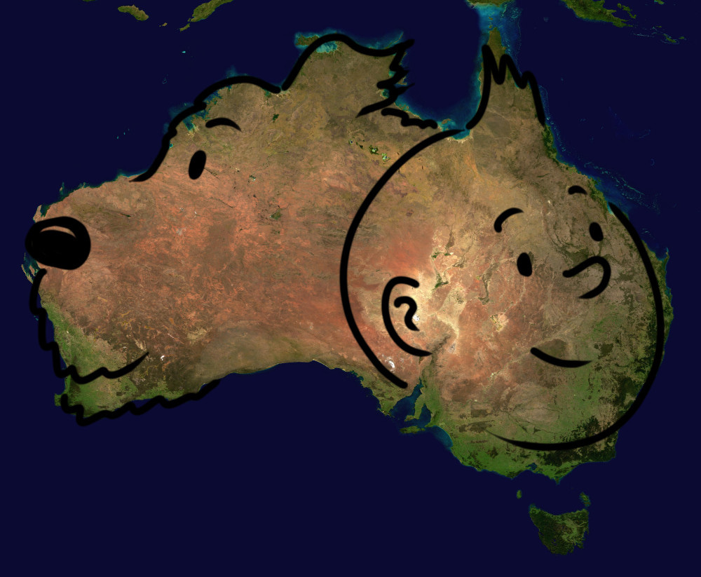
For the last map, I’m bringing one that makes me smile.
The author, Andrew ‘TmsT’ Kepple, says that he had always seen a dog’s head in the western part of Australia. A few days ago, he realised that the eastern part of Australia could also correspond to another silhouette, giving form to this lovely drawing of Tintin and Snowy, his dog.
By popular demand, here’s a button for procrastinating, in case you have plenty of things to do, but you don’t feel like. Each time you click on it, it will take you to a different map from the more than 1,200 in the catalogue.
If you like what you read, don’t hesitate to subscribe to receive an email with each new article that is published.
Thinking specifically of Trump and Netanyahu.
In case you don’t know it, Flight Radar is a delightful website where you can interactively navigate all international air traffic in real time. With data on each of the planes that fly through the skies.
Here is a source that validates this data, but there are many others showing the same numbers.
In addition to Switzerland and Norway.
In the case of Kiribati and the Maldives, although the islands of these countries are located around the equator, both north and south, none of their islands are exactly on the equator line.
Thank you for compiling this, Miguel. I've been keeping away from the news, as life takes precedence. This was a good way to catch up with global affairs, and peppered with lovely maps too! I definitely need my news in this flow and format more often! 🙂
Very contemporaneously helpful in understanding events. Gracias, Miguel.