

Maps of the Month: April 2026
The most interesting maps and articles I came across in April 2026

This year is dragging on. The news is more or less the same every month and, in a way, this has a big influence on the maps I’m bringing you in these rounds of the Maps of the Month. As I also like to brighten people’s days, I’m going to leave you with two recommendations before we begin. The first is musical: American Football’s fourth album1, 27 years after their debut, strikes me as a real masterpiece. The second is a series: For All Mankind2; if you haven’t seen it, I envy you because it means you have four-plus seasons of episodes to look forward to.
And now, on to the maps. Here is the list of what you’ll find in this edition:
The End of Orbán
Cables Under Fire
Disputed Borders
The Seven Seas of Antiquity
Refugees from the Middle East
Global CO₂ Emissions
The Great Paper Divide
OpenGridWorks: The Global Power Grid
Map of the Island of Desire (1931)
Where and when?
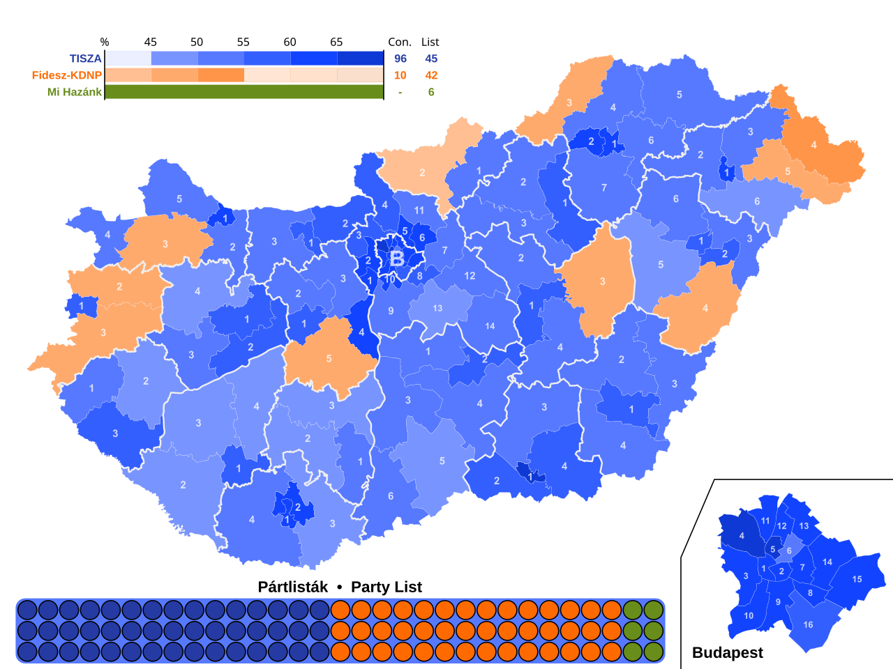
The End of Orbán
Viktor Orbán had become one of the European Union’s major political problems. During his 16 years as Hungary’s prime minister, he had ensured that the Russian perspective was brought to the table and that all consensus on the right was thrown overboard.
On 12 April, Hungarians said farewell to Orbán with a clarity that surpassed even the opposition’s most optimistic polls. In the map above, one can see how Tisza, led by Péter Magyar, secured an overwhelming majority against Fidesz, Orbán’s party. This is not a radical shift, as Péter Magyar still operates within a centre-right ideological framework, but he does have a clearly European agenda, which could speed up many processes that have been stalled for years within the European Union.
Cables under fire
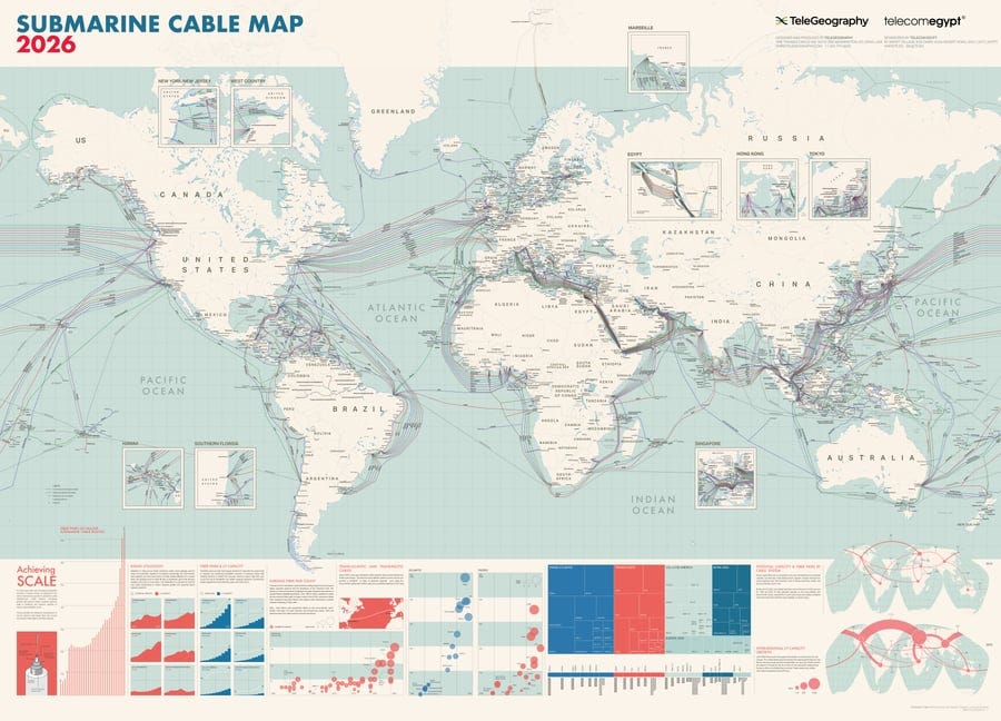

Last month we discussed the Strait of Hormuz and how its closure had become one of the most direct impacts on the global economy. We are all aware that the region produces a large proportion of the world’s fuel oils, but we often overlook the fact that at the bottom of the Persian Gulf and the Red Sea lie a significant portion of the communications links connecting Europe, Asia, and East Africa.
The map you see above is the 2026 version of the submarine cable map published annually by TeleGeography3. On their website, you can also consult the interactive map at any time, which keeps the layout of submarine cables worldwide up to date, with details on each of these cables.
Disputed borders
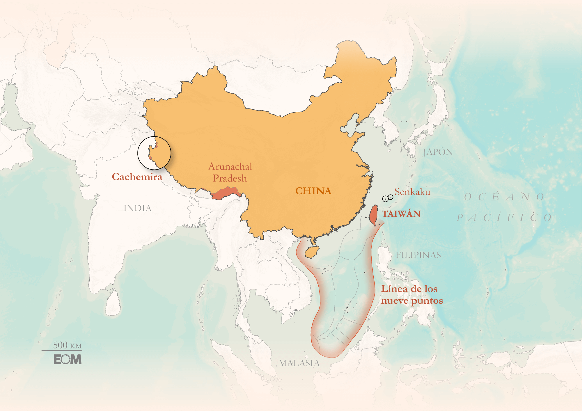
Borders are a fascinating subject4. Among other things, they provide a fairly accurate picture of the political world view, though of course not all of them enjoy the same level of consensus. El Orden Mundial has published a lengthy essay5 reviewing some of the world’s most significant border disputes, accompanied by maps illustrating the nature of these disputes.
Among all the topics, there is this one I’m bringing you from China, where territorial disputes with India, Taiwan and almost all the countries of Southeast Asia arise due to the nine-dash line.
The seven seas of antiquity

In almost all European countries and much of the Western world, the concept of the seven seas exists. It is an expression that has been used throughout the history of the Mediterranean, taking particular hold in Ancient Greece and the Roman Empire6. As was often the case in antiquity, this list was not set in stone, but during the Middle Ages it eventually took the form that has become established in popular culture.
Chronocarta has published this map on which the seven seas can be easily identified: the Black Sea, the Caspian Sea, the Red Sea, the Mediterranean Sea, the Adriatic Sea, the Arabian Sea and the Persian Gulf.
This list was the one popular in Europe, but there were many other lists of seven seas, as each civilisation made sure to include among the seven seas those that were most important to them. As an abstract concept, the seven seas defined the boundaries of the known world.
Refugees from the Middle East
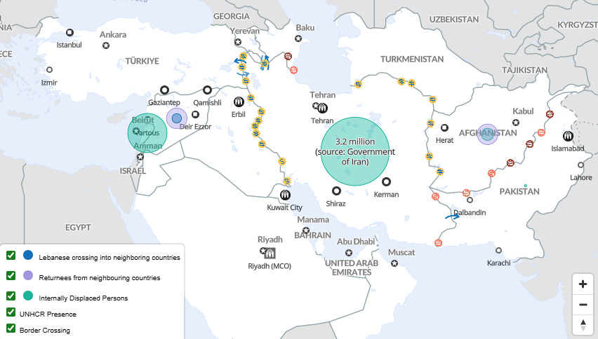
Returning to the Middle East and the war in Iran, it’s time to talk about refugees. For the past few weeks, Iran, and the United States have sat down on several occasions to negotiate an end to the war, although it does not appear that their positions are converging significantly. Meanwhile, tensions remain high, Israel continues to attack Lebanon, and millions of people have still not been able to return to their homes.
Lately, when we spoke of displaced people in the region, they tended to be concentrated in the countries neighbouring Syria and Afghanistan, where the fiercest conflicts have taken place in the past decades, but the war initiated by Trump and Netanyahu is changing the dynamics.
This map published by UNHCR already puts the number of displaced people in Lebanon at over one million and in Iran at over three million. What is most striking is how Syria and Afghanistan have received many of the refugees who fled years ago, accompanied by new displaced people, now travelling in the opposite direction: from Lebanon to Syria, and from Iran to Afghanistan.
Global CO₂ emissions
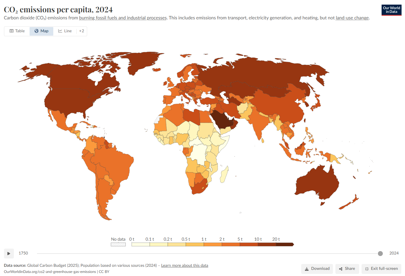
On 22 April, as every year, Earth Day was celebrated once again. The news is so dominated by the war in Iran, AI and the various political scandals in every country that there was barely any room for the usual reminders about the state of the climate. That is why I wanted to take this opportunity in this month’s edition of the maps.
This map from Our World in Data7 provides a clear visualisation of per person CO₂ emissions for every country in the world. The Gulf states continue to pollute without much restraint, as do countries such as the United States, Australia, Russia, and Canada. The figures for European, Latin American and Asian countries, whilst better, are still far from ideal.
In the same vein, I think it’s also worth including another map here showing total emissions across the globe. Naturally, the most populous regions lead the way, but note the emissions that don’t belong directly to any country, but rather to maritime transport.
")
The great divide in paper standard
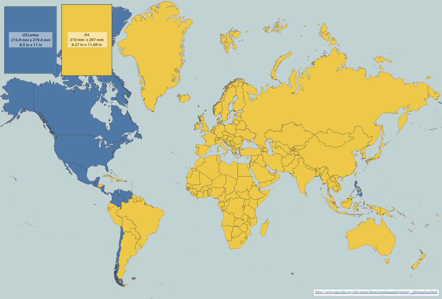
It is well known that the United States is one of the few countries in the world that still uses the imperial system of measurement. But what is rarely mentioned (and which some of us have experienced first-hand) is that the United States and a handful of other American countries have not adopted the A4 paper size; these are all the countries shown in dark blue on the map. There, they still use the US Letter size, which is slightly wider and shorter than A4.
The difference is minimal, just 6 millimetres in width and 17 millimetres in height, but the consequences can be significant. Just try printing a document in Europe when the printer is set up for the US market: a disaster. We print less and less these days, so it’s less likely to happen, but the possibility remains.
OpenGridWorks: the global electricity grid
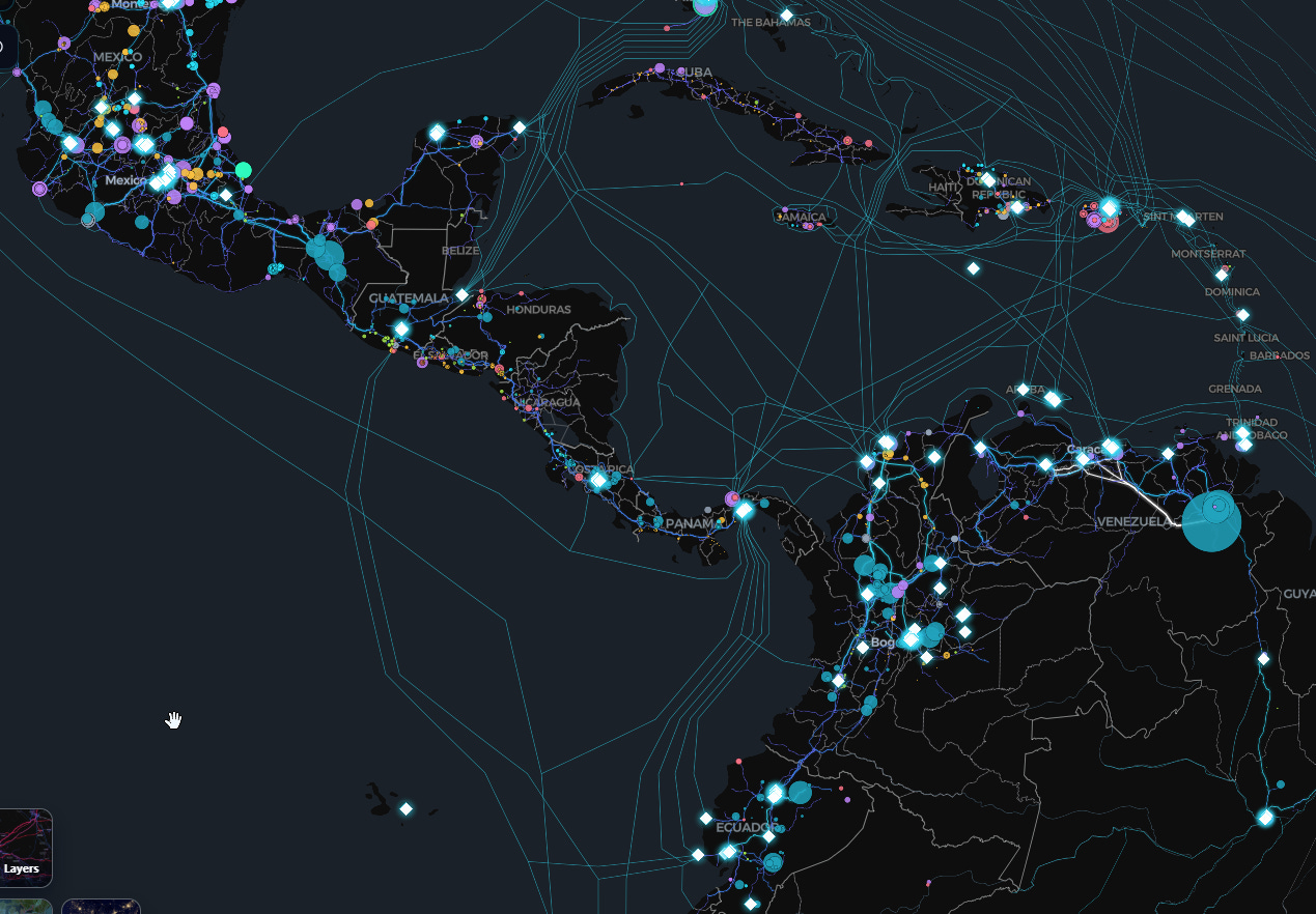
Alejandro Polanco shared this wonderful map a few days ago, and I had to make sure you all saw it too.
OpenGridWorks is an interactive web showing the 120,000 power stations, 2.7 million transmission lines and 800,000 substations around the world. You can look up all the data centres in any country, and even charging points for electric cars.
As is to be expected with these maps, the quality of the data greatly limits the coverage. In the United States and Europe, the data is detailed, whilst in other regions it is more limited. But for a general overview, it likely offers more detail than most other tools out there.
Map of the Island of Desire (1931)
")
Maps usually show the surrounding territory, but every so often they simply become an incredible allegory for addressing a reality. This map by Heinie, published in 1931, reflects the sentiment of Americans towards Prohibition, which had been attempting to control alcohol consumption in the country since 1920.
The map is littered with geographical features intended to mock the law’s inefficiency and the reality that almost everyone was still drinking almost as much as before, whether in the Whisky Strait, Rum Bay or Champagne Lake. One thing is certain: everyone would end up the next morning in the Hangover Hollow.
Where and when?
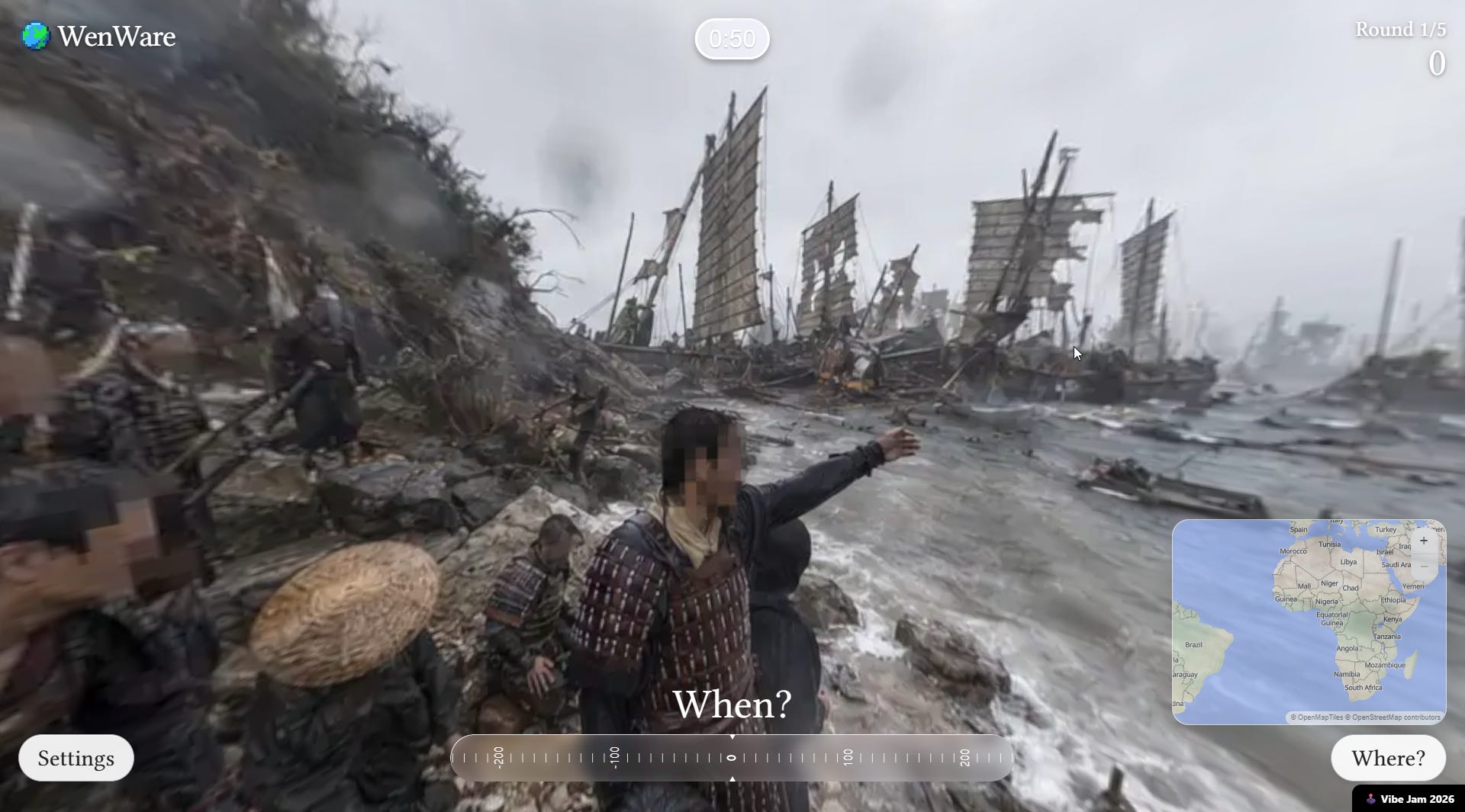
To finish off, I’ll leave you with a game that several people sent me a few days ago.
Many of you are probably familiar with GeoGuessr, the game that drops you somewhere via Street View and expects you to pinpoint exactly where in the world it is. Well, WenWare takes it a step further and shows you a historical event, asking you to identify the year and place where it occurred.
The 360-degree images used in the game are created and rendered using AI, so in some cases the locations aren’t entirely realistic, but it’s still good for a bit of fun. You can read more about the creator on Reddit.
By popular demand, here’s a button for procrastinating, in case you have plenty of things to do, but you don’t feel like. Each time you click on it, it will take you to a different map from the more than 1,200 in the catalogue.
If you like what you read, don’t hesitate to subscribe to receive an email with each new article that is published.
If you’re not familiar with their debut album, I highly recommend it. It’s one of those gems that, back in 1999, went largely unnoticed. Over time, it has managed to amass a well-deserved reputation.
Their latest album, the fourth of their career, explores a deeper post-rock sound, with a result that I’ve truly enjoyed.
For those unfamiliar with the series, it’s an alternate history in which the Soviet Union are the first to reach the Moon. As a result, the space race continues over time and both the achievements and the technology go much further. The problem is that it’s only available on Apple TV.
Years ago, the 2023 version of this map also appeared in the catalogue. Which, to be honest, I find much more aesthetically interesting.
Some time ago, I dedicated a post here to the 315 borders of the world.
In Spanish, I’m afraid. But even if you don’t understand the language, you can take some time to enjoy the maps.
Seven, that magic number so beloved in Rome and Greece. The same number used to list the wonders of the ancient world.
The website is also interactive, in case you’d like to see how it has evolved over the years.
I found out about the paper size problem sending a legal client a document to Germany to be signed for filing in an American court (I am in probate court which is still fairly paper heavy…) and for our County Recorder - deeds need to be original signed documents too. . She has to buy “special” American sized paper for purposes of dealing with her affairs in the U.S. a pain I didn’t even know existed!