

An official atlas of North Korea
A North Korean atlas that shows the world from the perspective of one of the most isolated countries on the planet.

What I bring you today is a real gem that I have been searching for a long time and have finally managed to get my hands on a copy1. It is a collection of 672 maps found in the Great Korean Encyclopaedia2, North Korea’s reference encyclopaedia. More specifically, it is an electronic edition published on CD in the first decade of the 2000s3.
Work on this encyclopaedia began in 1964, when Kim Il Sung established a compilation committee with the aim of bringing together all the knowledge and guidelines that a good Korean should follow4. The work spanned several decades, and the result was published in thirty volumes between 1995 and 2002. The encyclopaedia contained more than 100,000 words, 25,000 images and photographs, and 5,200 historical figures.
And maps, lots of maps.
The maps of Korea
According to the prevailing narrative in North Korea, the war was won by the communists and since then, the entire Korean peninsula has remained united under the rule of the Korean Workers’ Party. Therefore, when looking at the maps in this atlas, it should come as no surprise that Korea is always shown as one country, with no reference to the other country that exists at the southern tip of the peninsula.
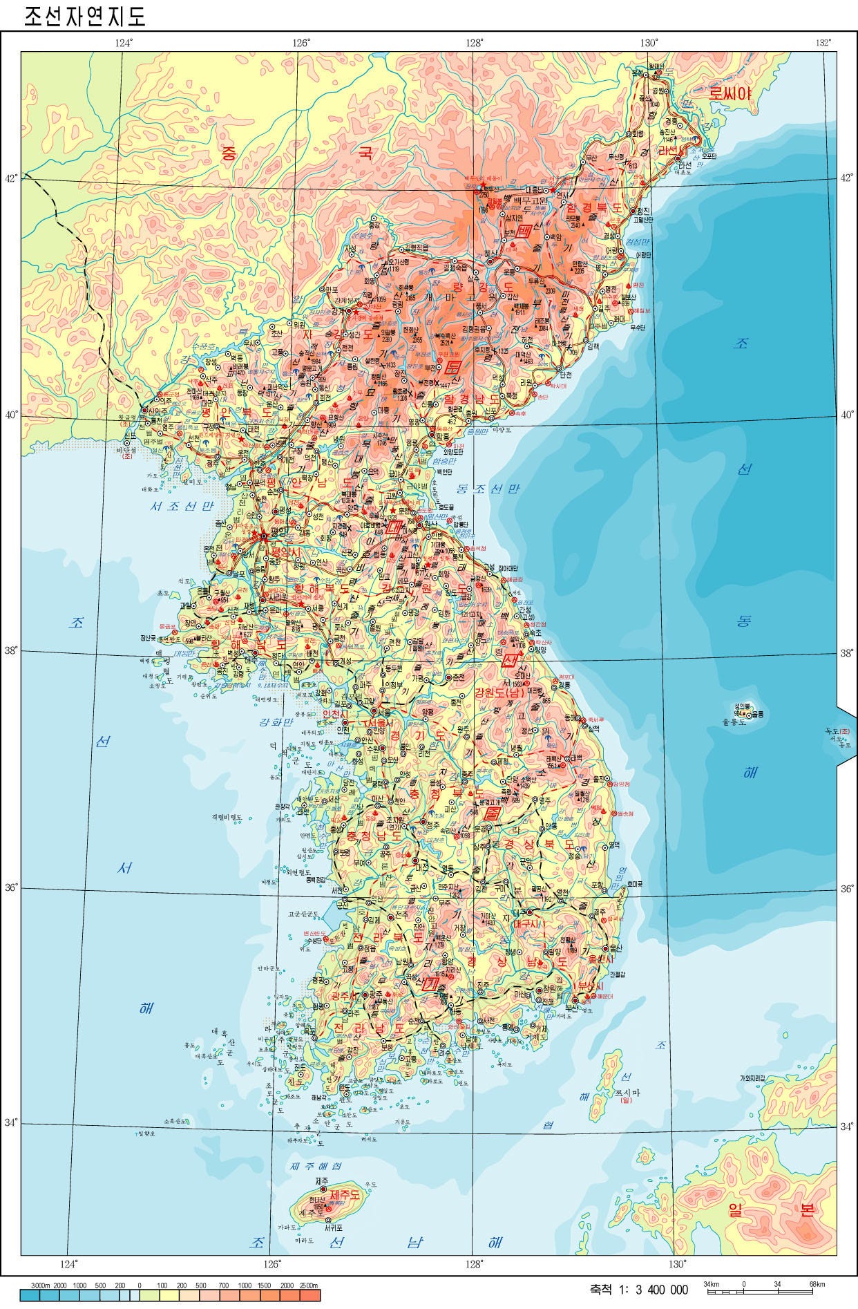
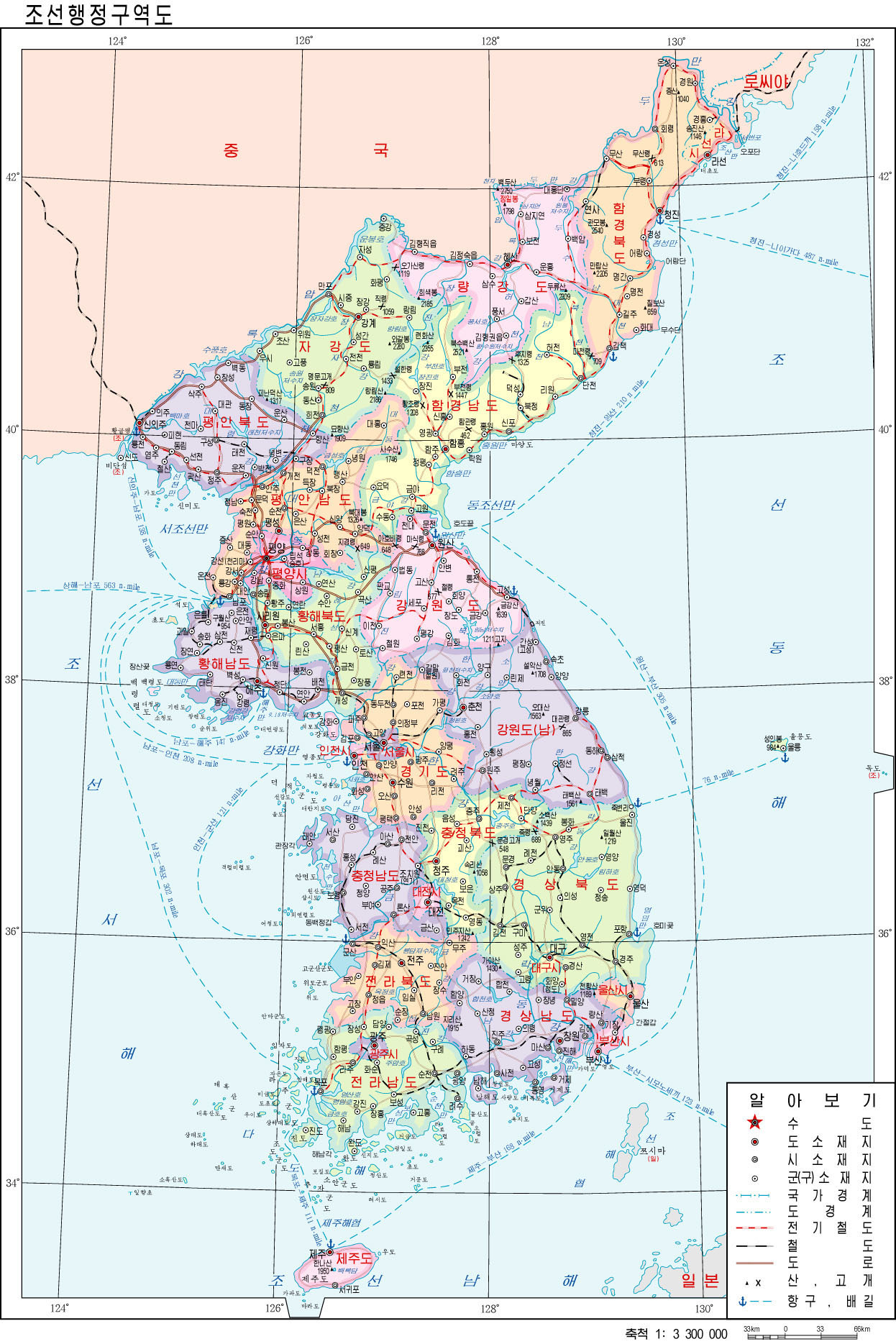
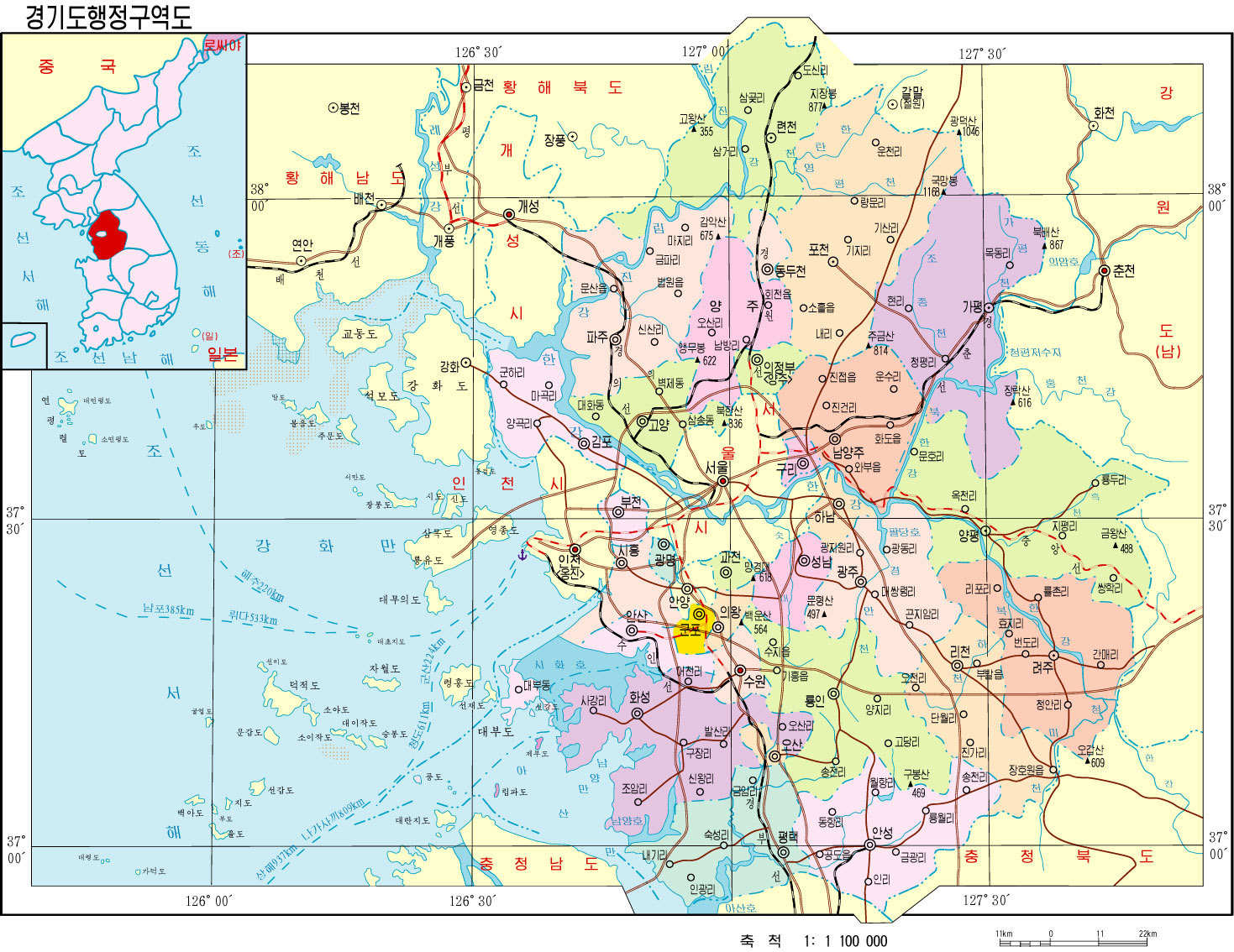
In addition to generic maps of Korea, like any good atlas, the encyclopaedia also includes detailed maps of each of the provinces and counties that make them up. Again, it makes no distinction between north and south, maintaining that narrative of unity.
World maps
When we delve into the global vision of North Korean cartography, things become even more interesting. So I’ll start simply with the world map.
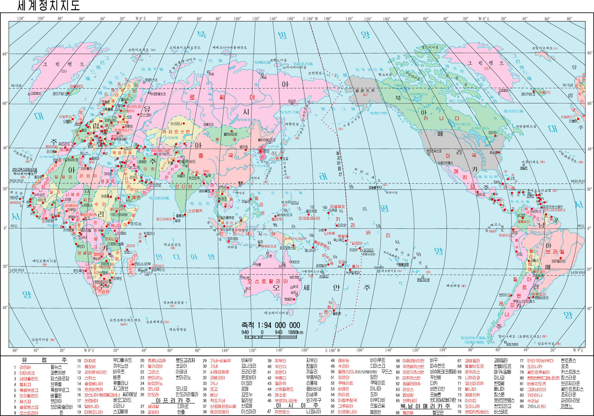
This North Korean world map is centred on the Pacific Ocean, which gives Korea a privileged position on the global stage. This is nothing new, but what is new is how North Korea depicts its enemies. Can you spot them?
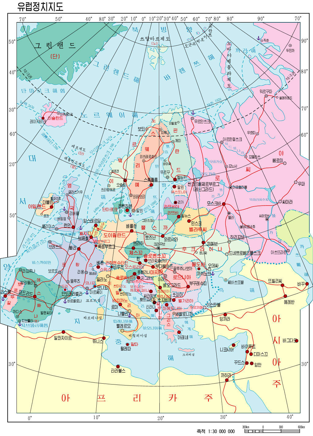
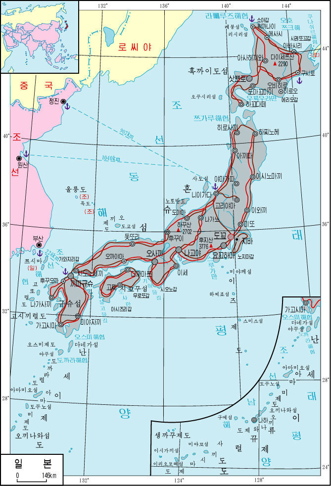
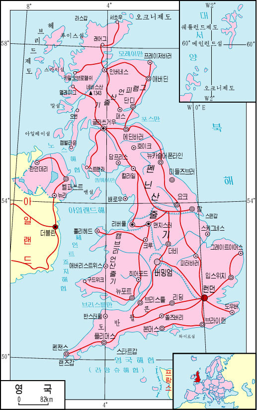
Yes, they are the only two countries painted in dark grey: the United States and Japan. This pattern can also be seen on the political map of Korea5, and is consistent on virtually all the political maps in the atlas. In the map of Europe, that you can see below, this colour is also used for the United Kingdom and France, but in this case, it is not consistent through all the political maps.
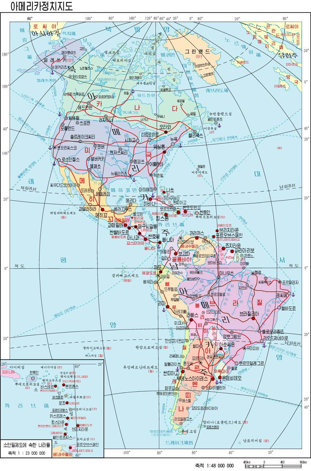
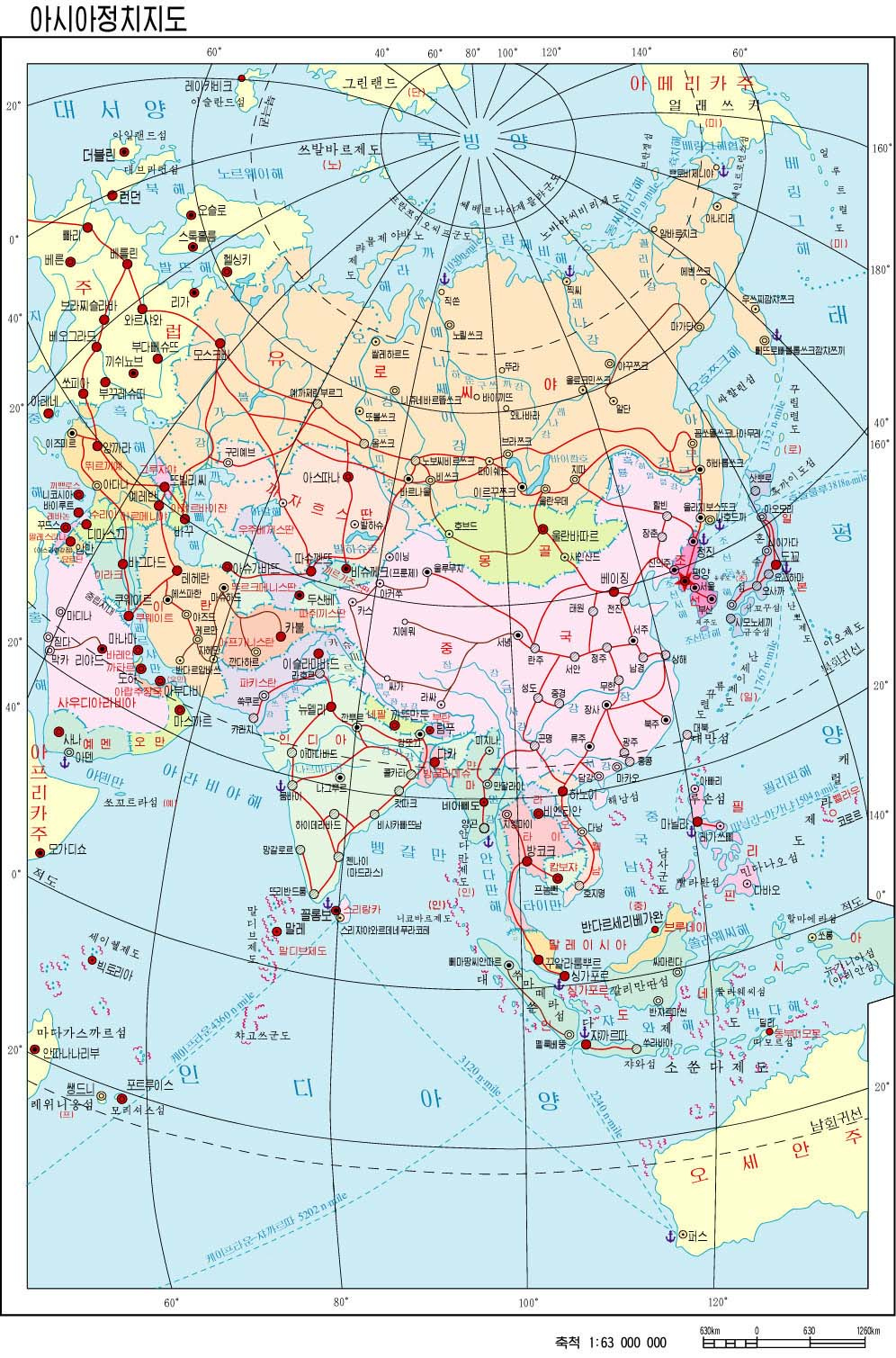
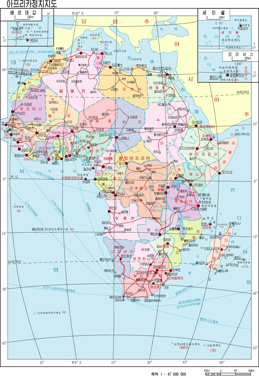
The representation of the continents is also of some interest. Apart from the idea of showing enemies in a consistent colour, I like the choice of projections. Instead of opting for the classic projections seen in Western cartography, the authors of these maps choose projections that better balance the shape and size of different countries. They take advantage of the fact that only one region of the globe needs to be represented.
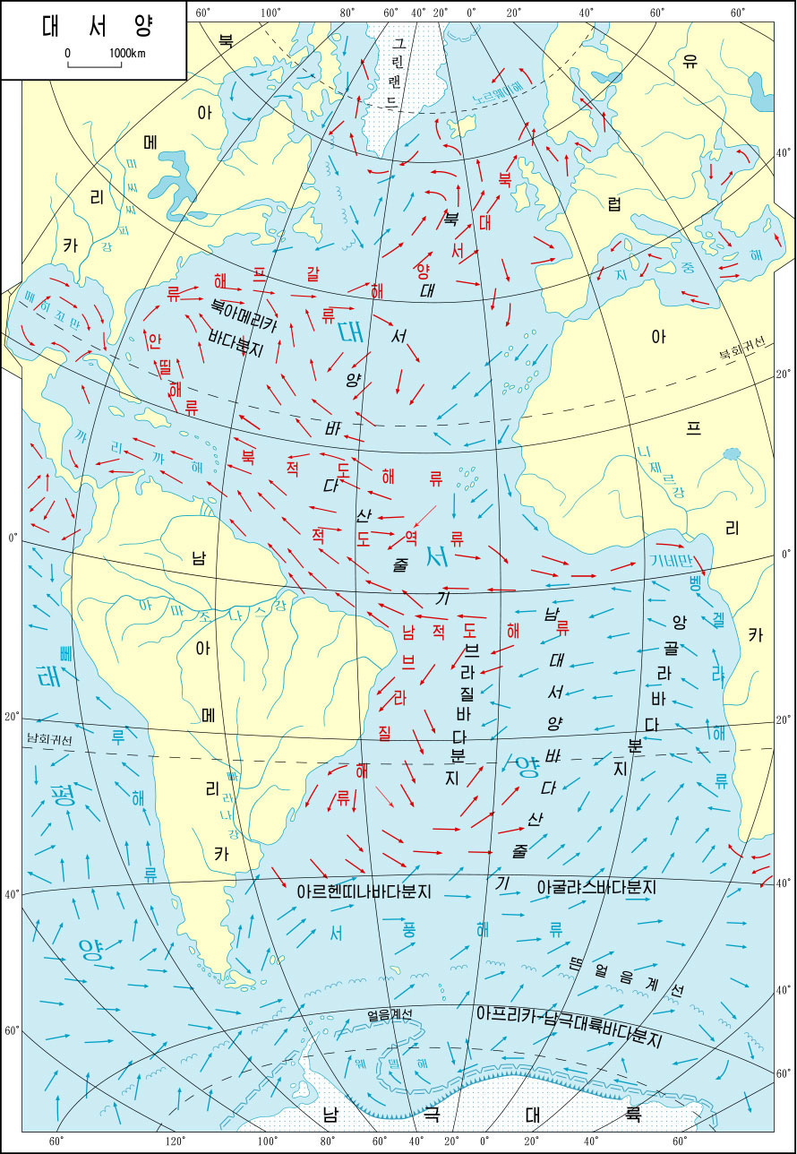
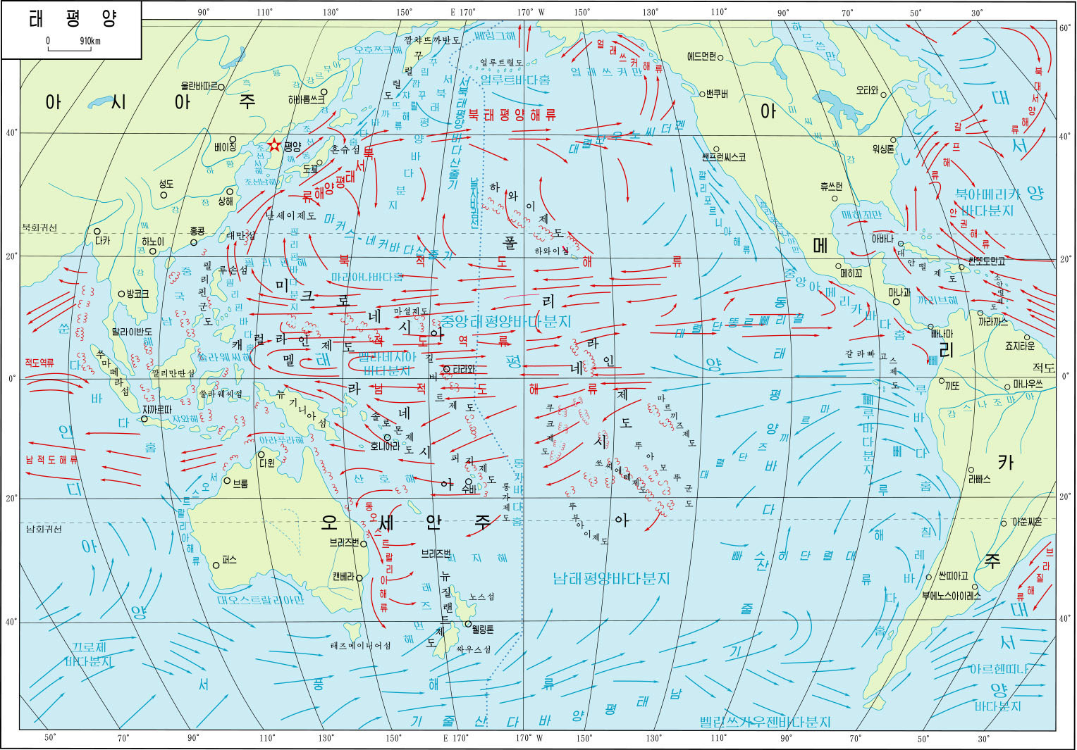
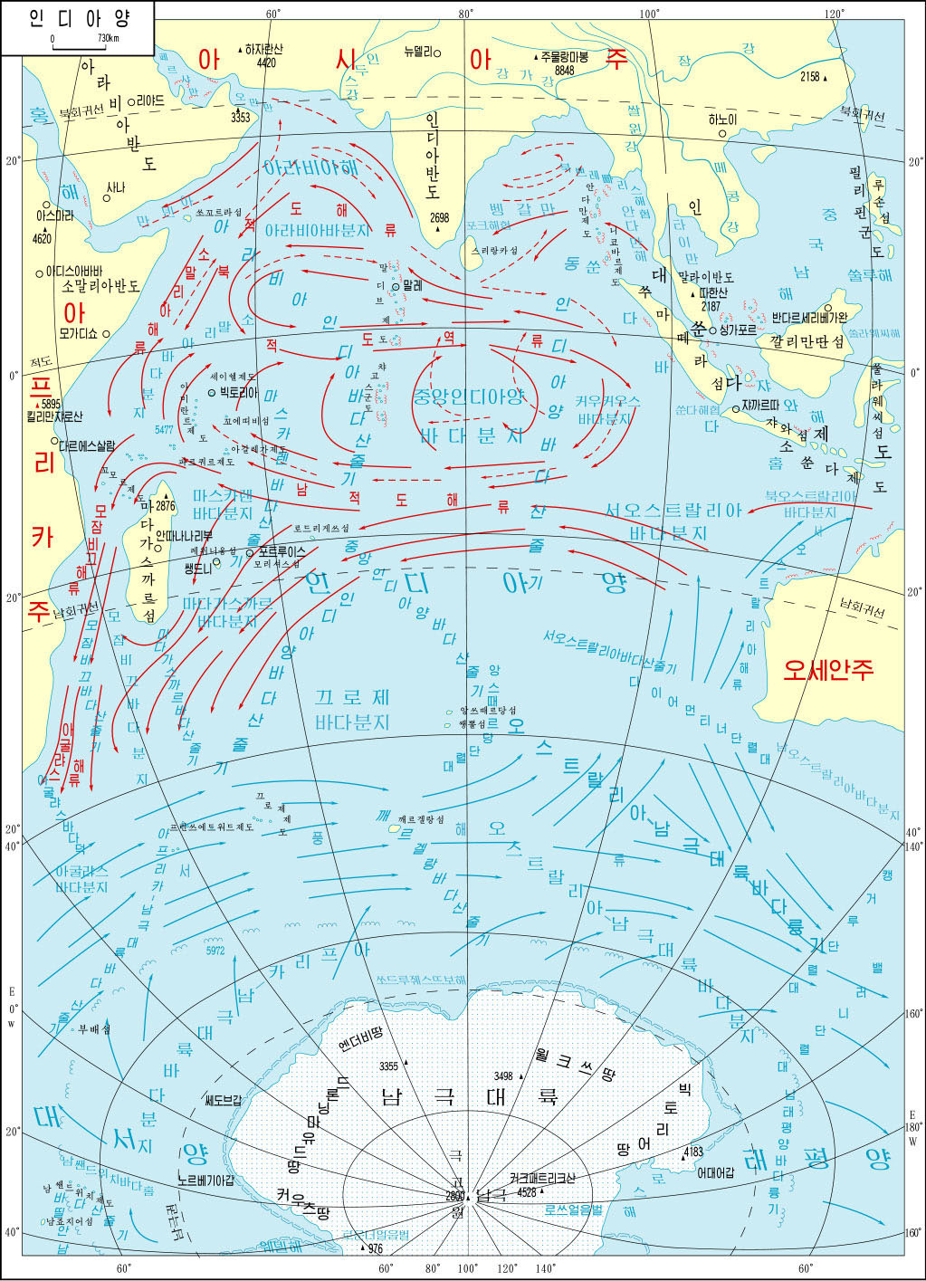
The encyclopaedia also includes maps of all the oceans, which also incorporate ocean current patterns.
Country maps
This collection would not be complete without country maps. Here, once again, we find a strong emphasis on the geopolitical situation and North Korea’s view of the world. This is consistent with the political maps of each continent, but when viewed separately, it is even more evident.
First, the maps dedicated to enemies.
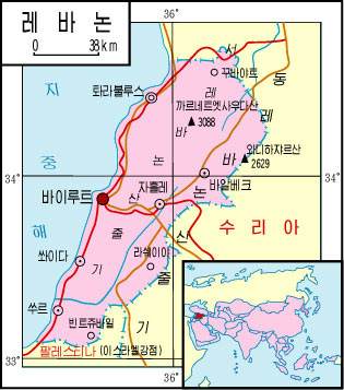
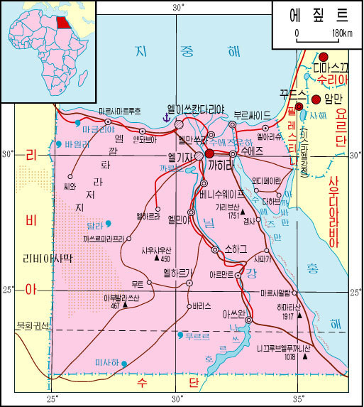
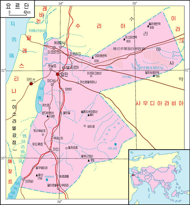
Beyond these obvious things, there are more subtle issues that can be understood by looking at the complete list. The only country that does not have a dedicated map is Israel. In fact, Israel does not appear under that name on any map, but the territory of Israel appears as Palestine on the map of Asia and on all maps of surrounding countries. In the one for Jordan, it is also clarified that Palestine is a territory under Israeli occupation.
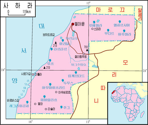
Another curious detail is that the atlas includes a country with limited international recognition6: the Sahrawi Arab Democratic Republic of Western Sahara.
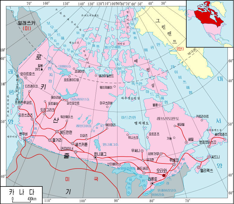
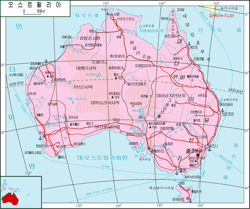
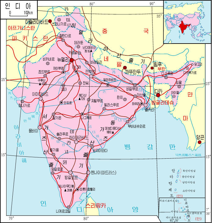
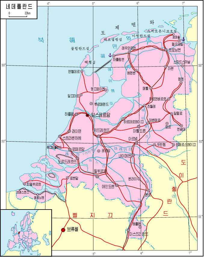
And well, although it may not be of general interest, as most of the readers are from countries with large English population, here you can see how some of these countries are represented.
If you are interested in any other map, please let me know in the comments and I can update the article.
Acknowledgement: I owe today’s article entirely to Pedro Zurita, the man behind the Mapoteca de pZZ, thanks to whom I got a copy of this fabulous atlas. I recommend that you follow him on Instagram, where he posts many maps, especially of Mexico, and on TikTok or YouTube, where he posts interesting videos on cartography and geography (in Spanish).
By popular demand, here’s a button for procrastinating, in case you have plenty of things to do, but you don’t feel like. Each time you click on it, it will take you to a different map from the more than 1,100 in the catalogue.
If you like what you read, don’t hesitate to subscribe to receive an email with each new article that is published.
A few weeks ago, Pedro Zurita got me a copy. And it made me very, very happy. At the end of the article, I have included information so that you can follow him on social media.
조선대백과사전, by its title in Korean.
While researching, I noticed that there is a digital edition from 2001, although it is possible that the copy I have was published later. Considering that there are maps with Timor-Leste and Montenegro as independent countries, but South Sudan still appears united with Sudan, it is plausible that the collection of maps is from an edition between 2007 and 2010.
This is understood to be North Korean, but within North Korea’s narrative, Korea remains united.
On the second map of Korea, the political map, in the lower right-hand corner, part of Japan is painted in the same dark grey colour. This is a deliberate choice, as it clearly differs from the colour chosen for China and Russia on the same map.
No European country currently recognises Western Sahara as an independent country, and very few in Asia do. Most of the countries that recognise its independence are in Africa and Latin America. And, of course, North Korea. You can see the details here.
Amazing, pink still the colour of the British Empire. Strange that they show the Grand Union Canal linking London and Birmingham (also the Leeds-Liverpool Canal) but leave off the Thames completely. Are they planning to invade with a fleet of narrow boats?
I am from the north east of India. What I find interesting is that they have omitted one of the states here - Arunachal Pradesh. It is claimed in its entirety by China as South Tibet as part of the Tibet Autonomous Region. During the 1962 Indo China war they were able to occupy parts of Arunachal Pradesh but later withdrew their forces. North Korea, being an ally of China, has chosen to depict this narrative in their official maps.