#30DayMapChallenge: 21st century cartographers
A wonderful challenge that allows us to dive into the work of some of today’s most creative cartographers and illustrators.
In October 2009, Jake Parker created the Inktober initiative. It was a fairly simple idea: to consistently produce one ink drawing every day for 31 days in October so that the practice would help him improve both his skills and his work habits. In just a few years, the initiative grew significantly around the world, with thousands of artists signing up for this challenge every October.
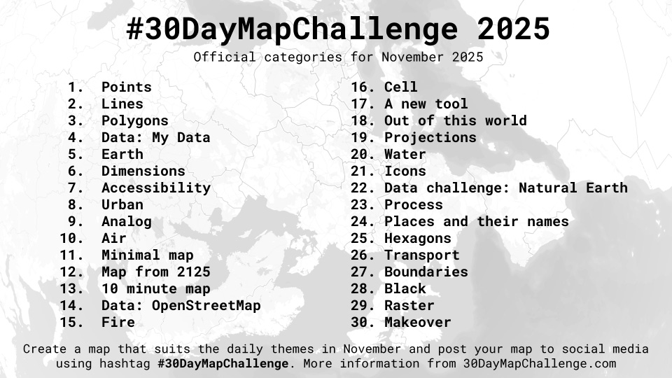
With this idea as inspiration, in 2019 Topi Tjukanov started the #30DayMapChallenge initiative. In it, map creators were invited to publish one of their works each day for 30 days in November. Topi included a few simple rules: the maps must be the work of the person publishing them, the source of the data must be credited1, and no maliciousness. In addition, in an attempt to encourage creativity and avoid repetitive maps, he proposed a specific theme for each of the 30 days. This November marks the seventh edition, with high participation on some major social networks, such as Twitter2, Mastodon, Bluesky and Instagram.
This initiative has helped me discover many data visualization and cartography professionals who are doing wonderful work, such as Terence Teo. Taking advantage of the event, this week I wanted to bring you some authors and some of the maps they have published as part of this initiative over the years. At the end, I will also leave you with a more extensive list of recommendations and links to many maps for you to explore.
Antonia Blankenberg
You can find Antonia on Twitter and LinkedIn, and learn more about her in this short interview with GeoHipster.

In this first map, with the theme of flows, the author represents surface currents, with different colours depending on their intensity.

For this second illustration, with the theme Asia, she uses different resources to simulate a typical map from spy films, despite it being simply a map of Wi-Fi networks in the city of Hong Kong.

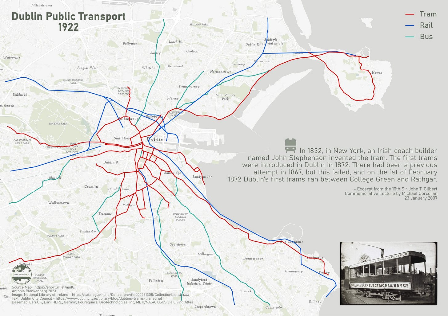
This last map by the author, with the theme analogue, depicts the Dublin tram network in 1922. It is a digitisation of an old map3, to give it a modern look.
Perrin Remonté
You can find Perrin on Twitter and Instagram. He also posts all his freelance work on his own website, where you can find some real gems.

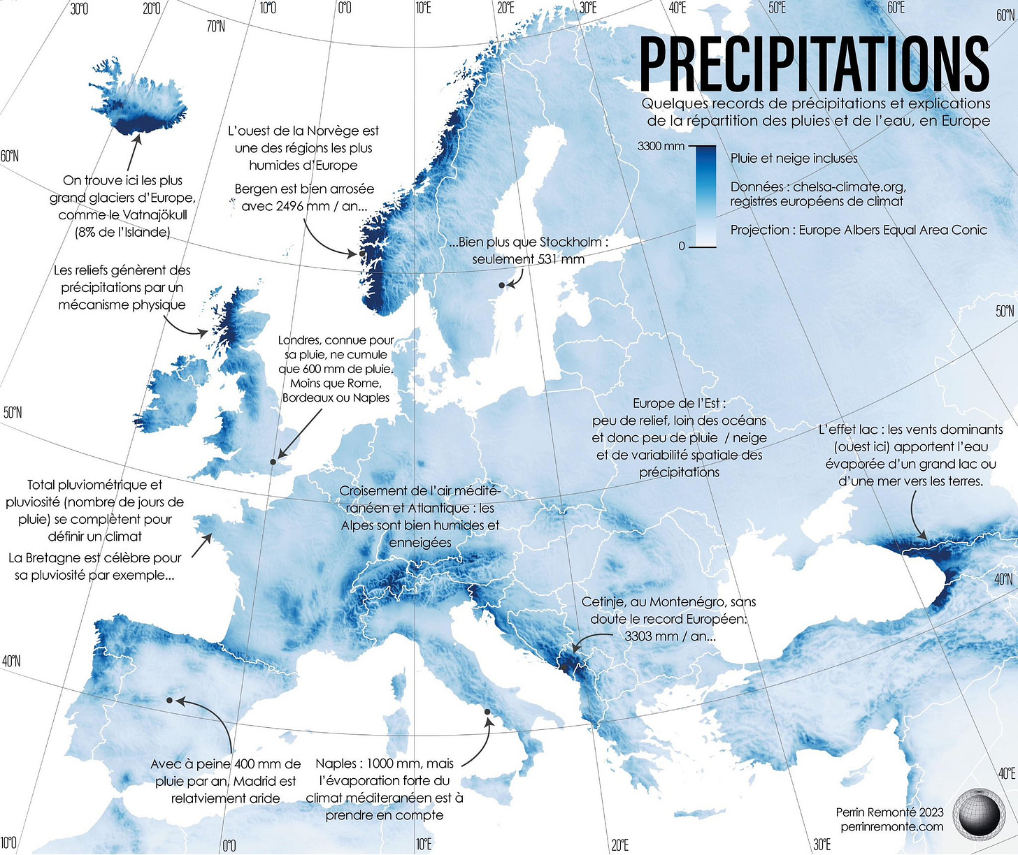
In this first map, with the theme atmosphere, the author depicts the average rainfall in each location in Europe. He also adds text to explain some relatively curious patterns, such as the fact that it rains much less in London (600 mm/year) than in Naples (1,000 mm/year).

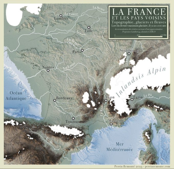
This second illustration, on the theme of Europe, shows France and its surroundings as they were 20,000 years ago, during the last glacial peak. You can see the permanent ice caps in the Alps and Pyrenees, as well as the land bridges that connected Corsica and Sardinia or Great Britain with continental Europe.

The last map, with the theme of North America, represents the Lewis and Clark expedition of 1804. This expedition was commissioned by Thomas Jefferson after the Louisiana Purchase and was the first by Americans to reach the Pacific Ocean.
Heather Chamberlain
You can find Heather on Twitter and LinkedIn. There is also some information about her on her profile at WorldPop.

In this first map, with the theme South America, the author presents a beautiful representation of the Galápagos Islands. It includes the topographic map of the islands in green and the bathymetric map of the waters surrounding the islands in blue.

This second map, with the theme Africa, shows the date of the last available census in each African country. The information on the map itself is not particularly interesting, but the graphic design is striking. Even welcoming.
Erwan Rivault
You can find Erwan on Twitter and LinkedIn, or in many BBC articles, where he works as a data and map designer.

I think this first map, with the theme Flow, is wonderful. It shows the Greenland ice sheet, with a colour code representing the speed of the ice. This allows us to see the areas where the ice is flowing into the sea (in dark red, at a speed of two kilometres per year) and the areas that remain more static (in white and light blue, at a speed of a few metres per year).

In this second illustration, with the theme Asia, Erwan shows the major rivers of Africa and their watersheds. He uses different colours to highlight the differences between the various watersheds.

I have included this last map, on the theme Analogue, because I find it quite humorous. The author takes the idea of analogue to the extreme, so he had to buy tomatoes of different sizes to represent the differences in production between different European countries.
More authors and more maps
I could go on talking about many of the authors and maps I have come across, but Substack4 is already warning me again. What I am writing is too long for a newsletter that many of you receive by email.
In any case, here is a link to most of the maps that were published in this challenge in 2019, 2020, 2021 and 20225. In addition, here is a list of many other cartographers, data analysts and artists that I have discovered thanks to this initiative, as well as some links to their work and social media. If you have any others that you find interesting and that do not appear here, please let me know:
Doug Greenfield: Mastodon.
Iskar Waluyo: Instagram.
Jacob L. Macdonald: Website, Mastodon, LinkedIn, and Twitter.
Nesuk Vadym: Twitter.
Nithya Subramanian: Website, LinkedIn, Instagram and Twitter.
Thiyangt: Mastodon.
By popular demand, here’s a button for procrastinating, in case you have plenty of things to do, but you don’t feel like. Each time you click on it, it will take you to a different map from the more than 1,100 in the catalogue.
If you like what you read, don’t hesitate to subscribe to receive an email with each new article that is published.
Where applicable, as not all maps are data-driven.
I refuse to call it anything else, sorry.
Substack is the platform used to send these emails.
Unfortunately, I have not been able to find a portfolio of the last three years on any website.


What a delightful collection! Definitely not for browsing on a tiny screen. This could be a rabbit hole that'll keep me occupied for a few hours (if not days!). I'm saving it for the holiday :D
Incredibly useful for some of my lessons...