

The maps of Charles Joseph Minard
A journey through the work of one of the pioneers in the use of maps as a tool for visualising information.

Following the release of Ridley Scott’s much-criticised film about Napoleon, I took another deep dive into Charles Joseph Minard’s most famous map.
Don’t know which map I’m referring to? Well, it is this absolute marvel.

I’ll tell you a bit more about the map later on. But yes, it is a masterpiece for many reasons. The great irony is that Minard’s reputation is often unfairly overshadowed by this map, yet his work was far more significant. That’s the reason I have decided not to focus only on this map, but on his wider work.
The early years of Charles Joseph Minard
Minard was born in Dijon, France, in 1781. It would most likely have been the case that he devoted his life to growing mustard, as was already common in the city1, but he was fortunate to have parents who encouraged him to study. By the age of four, he could already read and write, and at just fifteen he enrolled in the newly opened École Polytechnique in Paris2. From there he moved on to the École nationale des ponts et chaussées, where he graduated as a civil engineer.
This background, which may seem like just another biographical detail, is important for understanding the figure of Minard. His higher education was devoted to the branch of engineering responsible for building roads, canals, and railways. Moreover, he worked in this field for many years, which helped him to understand the movement of commercial goods and people.
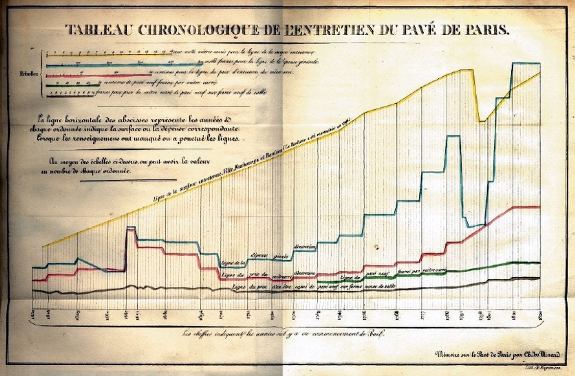
As part of his work, he began to create occasional graphs to better visualise the information. The first known example is the one you can see above: a chronological table he used to represent the arrival in Paris of materials for paving the city over the previous two centuries. Given that the map covers the years 1620 to 1820, and with no further details, can you identify when the French Revolution took place?
That’s right, a simple yet effective representation of data not only allows information to be displayed, but also makes it much easier to convey far more sophisticated information, or even to visualise patterns more clearly. Minard understood the usefulness of this method for representing information, but it was not until his retirement, forced at the age of 70, that he devoted his life fully to it.
Minard’s other maps
Since Arthur H. Robinson3 published an article on Minard in 1967, it has been accepted that Minard produced a total of 58 maps throughout his life4. Of all of them, only one has entered popular culture, but his work marked a turning point in cartography, understood as the science of representing information in a geographical context. Until the mid-19th century, many cartographers had worked to represent the earth faithfully on a map, but Minard went a step further.
His greatest innovation, undoubtedly, was flow maps. This type of representation shows the movement of information or objects between different points within a region. The colours and sizes of the lines help to symbolise what and how much is moving from one point to another. Where relevant, turning the lines into arrows also helps to provide information on the direction of that movement. It cannot be said that he was the pioneer, as that honour is usually assigned to Henry Drury Harness5 in 1837, but he did popularise their use and demonstrate their potential.

This is Minard’s first flow map, published in 1845. It shows the movement of public carriages along the roads between the areas around Dijon and Mulhouse. All this information, purely descriptive, was important for establishing the route and stops of the new railway line that would link Dijon and Mulhouse. Two hundred copies of this map were produced and distributed among the stakeholders in this project so that their decisions could be as informed as possible.
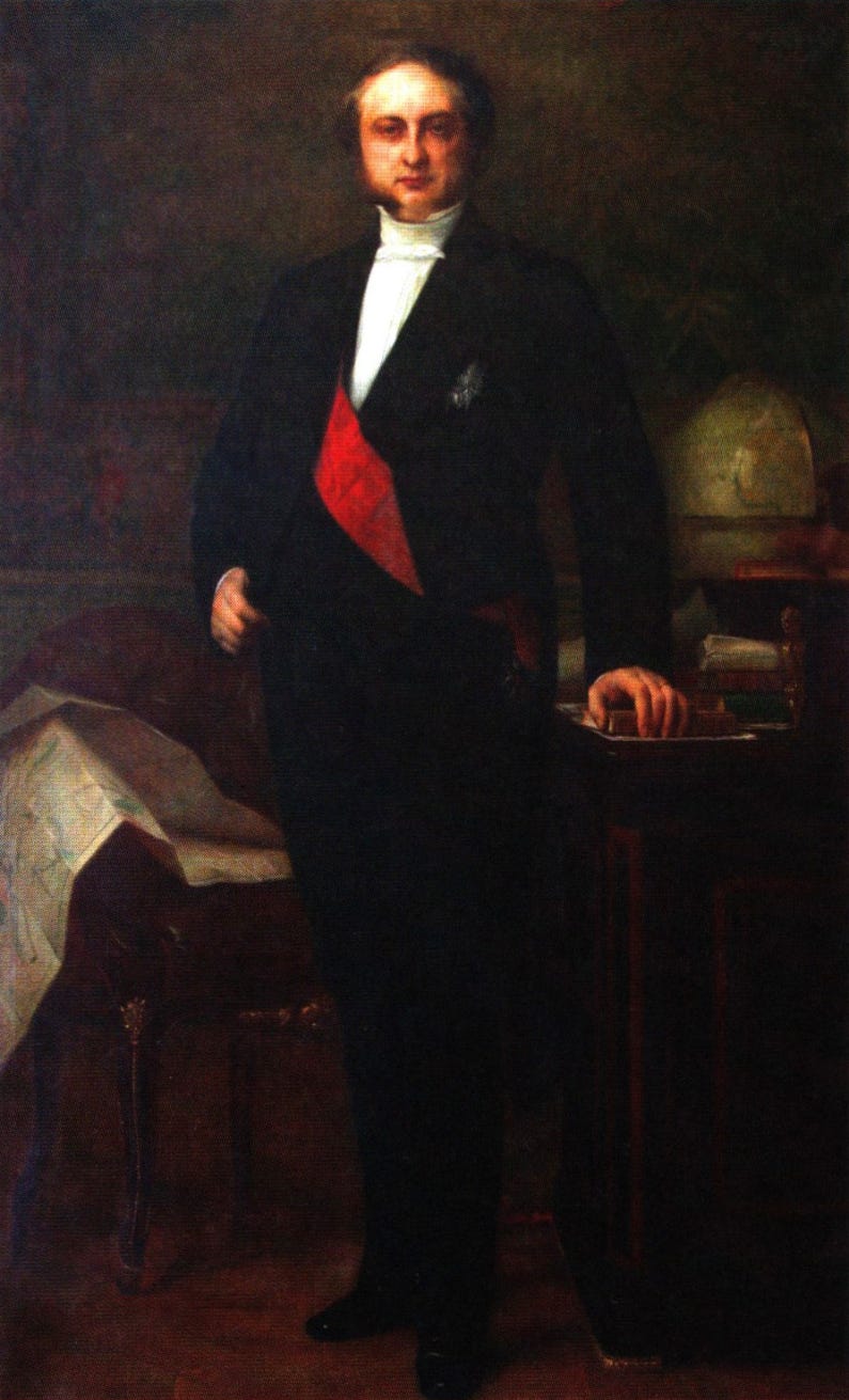
The context of the era is fundamental. In the mid-19th century, the railway and the telegraph were expanding rapidly across continental Europe, and this was attracting significant investment from modern states. Minard understood that it was critical to provide substantial information to those responsible for planning new works and innovations. His entire body of work could have been ignored by the authorities, but history shows us that nothing could be further from the truth. Every French Minister of Public Works who held office between 1850 and 1860 had their portrait painted with Minard’s work behind them. This was no minor gesture: at a time when the railway was a symbol of modernity and power, being visually associated with the maps that planned it was also a political statement. Perhaps the most iconic of all these portraits is that of Eugène Rouher, appointed minister in 1855, painted by Alexandre Cabanel.
Even if he only managed to publish 58 maps, all of them are somehow fascinating. I will present here the three I find most interesting, whether for the elegance of the representation or for the obvious utility they had at the time.

On this map, Minard divided each of the districts of Paris (in different colours) into four neighbourhoods. He marked a sample of post boxes with black dots and existing post offices with black dots circled. Furthermore, he included a square in each neighbourhood showing the neighbourhood’s population size and positioned it at the centre of gravity based on the population distribution within the neighbourhood. With all this information, he sought to make it clear which areas would benefit most from the installation of a new post office.
")
In this other map, Minard aimed to show the main population flows in the world. Although access to reliable data was limited in the 19th century, the author sought a representation centred on the available data. To achieve this, he established that each millimetre of thickness corresponds to 1,500 migrants, and the colours represent the origin of those emigrants. A curious aspect of this map is that, despite covering migration across all the continents of the world, Minard attaches a certain importance to French possessions, such as the islands of Réunion and Mauritius in the Indian Ocean. In a way, this map also seeks to highlight these islands as important commercial and economic hubs.
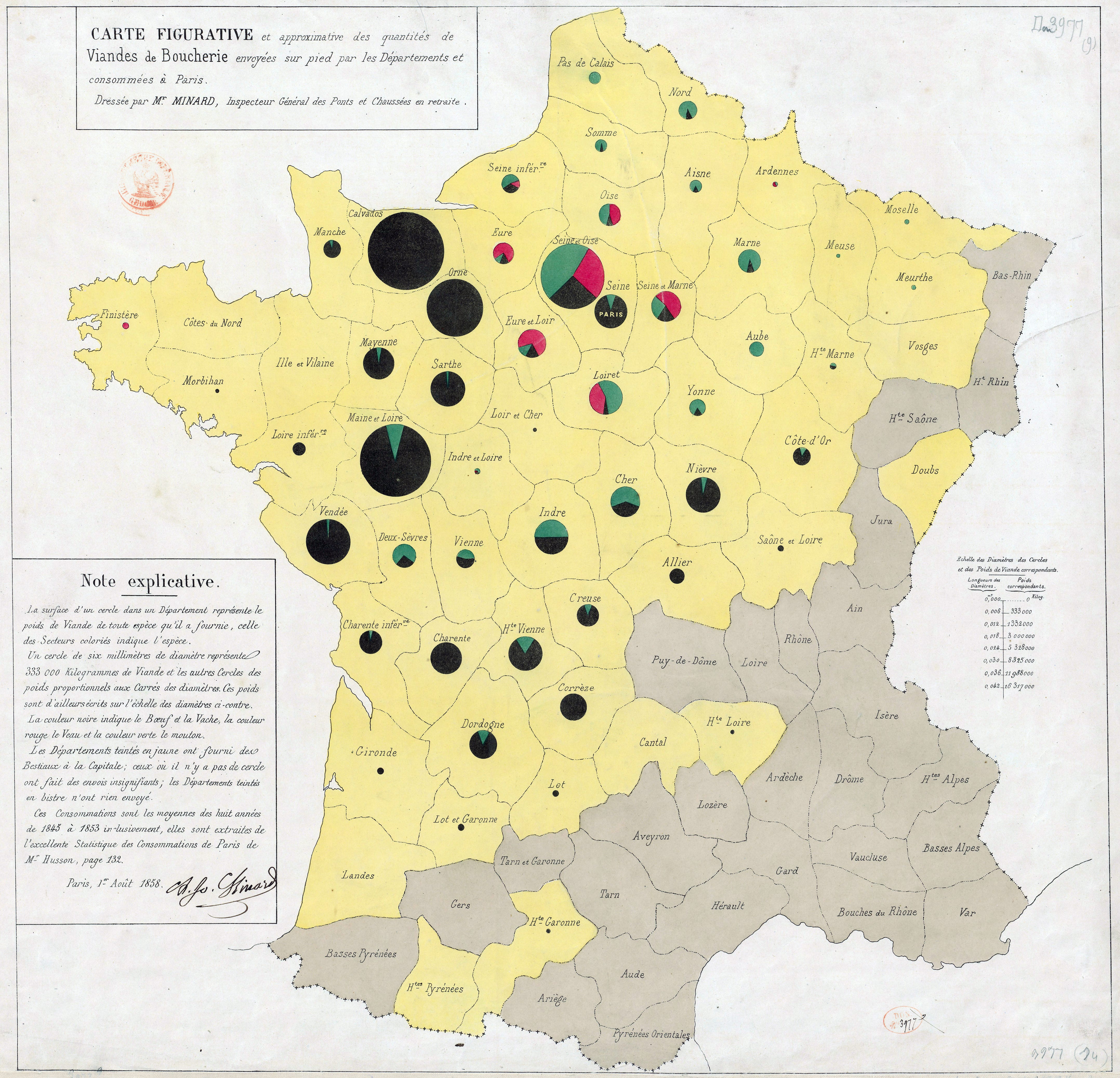
For the last map, I have gone for this particular piece for being one of the earliest uses of pie charts in cartography. On this occasion, Minard uses them to show the French departments that produced the meat consumed in Paris. All the departments that send goods to the capital are shown in yellow, and the pie chart for each department shows the total volume, indicated by the size of the circle, and the type of meat, indicated by different colours (beef, pork, and mutton).
This type of map became of great importance in geography for understanding the production and consumption of goods in detail. In fact, if you pick up any general atlas, in the section covering the economy of regions or countries, you will most likely see this type of representation that Minard first used.
Napoleon’s March on Moscow (1869)
The best graphic ever produced
This is how Edward R. Tufte described Minard’s illustration of Napoleon’s Russian campaign6. Others, such as Étienne-Jules Marey, went further and claimed that this map “defies the historian’s pen with its brutal eloquence”7. The consensus regarding this map is overwhelming. There are many ways to describe it in a few words, but it is undeniably Minard’s best work and one of the most important maps in the history of cartography.
Minard published this map in 1869, at the age of 88. It was one of the last maps he published and, clearly, it showcases everything he had learnt throughout his life. The idea is to summarise in a single illustration Napoleon’s invasion of Russia throughout 1812, which represented one of Napoleon’s greatest military failures and has gone down in history as a testament to how difficult it is to attempt to conquer Russia in the depths of winter8.
The greatness of this map lies in its ability to effectively represent information across multiple dimensions simultaneously, without the result being difficult to interpret. The first and most obvious features are the two lines, which follow Napoleon’s route from Kaunas, in present-day Lithuania, to Moscow. Beige is used for the outward journey, whilst black is used for the return journey.
Both lines vary in thickness as they move across Russian territory. The thickness is used to represent the number of men in Napoleon’s army along the route, a figure which is also repeatedly detailed alongside the line to make it easier to understand which units each thickness represents. Thanks to this, it is clear to see how the French army suffered sustained casualties throughout the entire journey.
To emphasise the reasons why Napoleon’s troops suffered so many casualties, at the bottom Minard also includes a graph showing the winter temperatures they faced on the return journey, matching measurements along the route to their specific geographical location and including the dates alongside the temperature.
Is this map by Minard accurate? No, certainly not. But that is also what demonstrates the genius of the work. Minard chooses which information to represent and which not, so the idea comes across effectively: Napoleon entered Russia with 422,000 men and returned with 10,000. He managed to reach Moscow, but had to return without conquering the city, and the winter caused many casualties. That is all.
 displaying the movements and the number of Napoleonic troops during the Russian campaign (1812-1813), as well as the temperature on the return path.")
This version, created by Martin Grandjean in 2014, adds further complexity to the graphic. It shows that Napoleon’s troops actually followed multiple routes, which split and merged along the way. All this provides additional information, but does not necessarily improve the idea. The additional multiple flows create a great deal of clutter, as do the borders, rivers and numerous cities, to the extent that the map’s main idea becomes diluted.
There is something that the map of Napoleon teaches us beyond military history: that the clarity of an idea does not depend on the amount of information it contains, but on what it chooses to omit. Minard understood this at the age of 88, after a lifetime of representing data. It is, perhaps, the most difficult lesson to apply in any form of communication.
By popular demand, here’s a button for procrastinating, in case you have plenty of things to do, but you don’t feel like doing any of them. Each time you click on it, it will take you to a different map from the more than 1,200 in the catalogue.
If you like what you read, don’t hesitate to subscribe to receive an email with each new article that is published.
I find the story of Dijon and mustard fascinating. For almost 400 years, it held a monopoly across France, and it is no exaggeration to say that it was the norm in the city. Here is an interesting article on the subject written by Emily Monaco in Atlas Obscura a few years ago.
The École polytechnique was founded in 1794 and Minard enrolled in 1796.
Robinson is the same cartographer who, decades later, would lend his name to one of the most widely used projections of the 20th century: this one.
Originally, only 51 maps were identified, but subsequent studies, such as that by Michael Friendly, increased that number to 58 maps.
Henry Drury Harness’s map shows the flow of passengers and commercial goods in Ireland. You can view it here. Attila Bátorfy has also identified an earlier flow map that deserves to be considered a pioneer.
He made this statement in his 1983 book, The Visual Display of Quantitative Information, one of the most influential books on the representation of information.
This statement forms part of his 1878 book, La méthode graphique dans les sciences expérimentales et principalement en physiologie et en médecine.
Napoleon would not be the last European leader to underestimate a Russian winter.
I observe that Minard’s map of the Russian Campaign leaves out the Russian army entirely.
Fascinating! Thank you.