

Cartographic projections: deforming the Earth to represent it
The history of a compromise that was created to resolve an unsolvable geometry problem. The virtues and shortcomings of some of the most iconic map projections.

To no one's surprise, I love maps. And like any map enthusiast, I've spent a lot of time reading about map projections. Understanding them is key to being able to interpret a map properly.
The earth, with its quasi-spherical shape, faces a mathematical problem that has no solution. The sphere, as a geometric figure, cannot be developed on a plane without incurring some kind of distortion. It is not that we have not found the right way to do it, it is that it is not possible. We will never be able to.
That does not detract from the fact that there can be good approximations, although all of them have some compromise. An easy way to understand it is that there are three fundamental characteristics that cannot be fulfilled simultaneously, so any projection has to reach a compromise between the three:
Distance: A world map that can preserve the distance between any two points once translated to the plane is considered an equidistant projection.
The areas: When the representation on the plane can maintain the areas of a polygon, for example each country, then we speak of an equivalent projection.
Angles: This characteristic refers to the angles and, therefore, the shapes of each polygon that we find on the map, for example the outline of a country. If the projection manages to maintain this peculiarity, then we call it conformal projection.
Geometry tells us that, since the sphere is not developable in the plane, it is impossible to find a cartographic projection that is simultaneously equidistant, equivalent, and conformal. So we can state categorically that there is no such thing as a correct projection. The most we can aspire to is to have multiple projections available and to use the most relevant ones for each occasion.
Here are some examples of popular projections, and some information to understand them a little better
Mercator, a projection with a utility
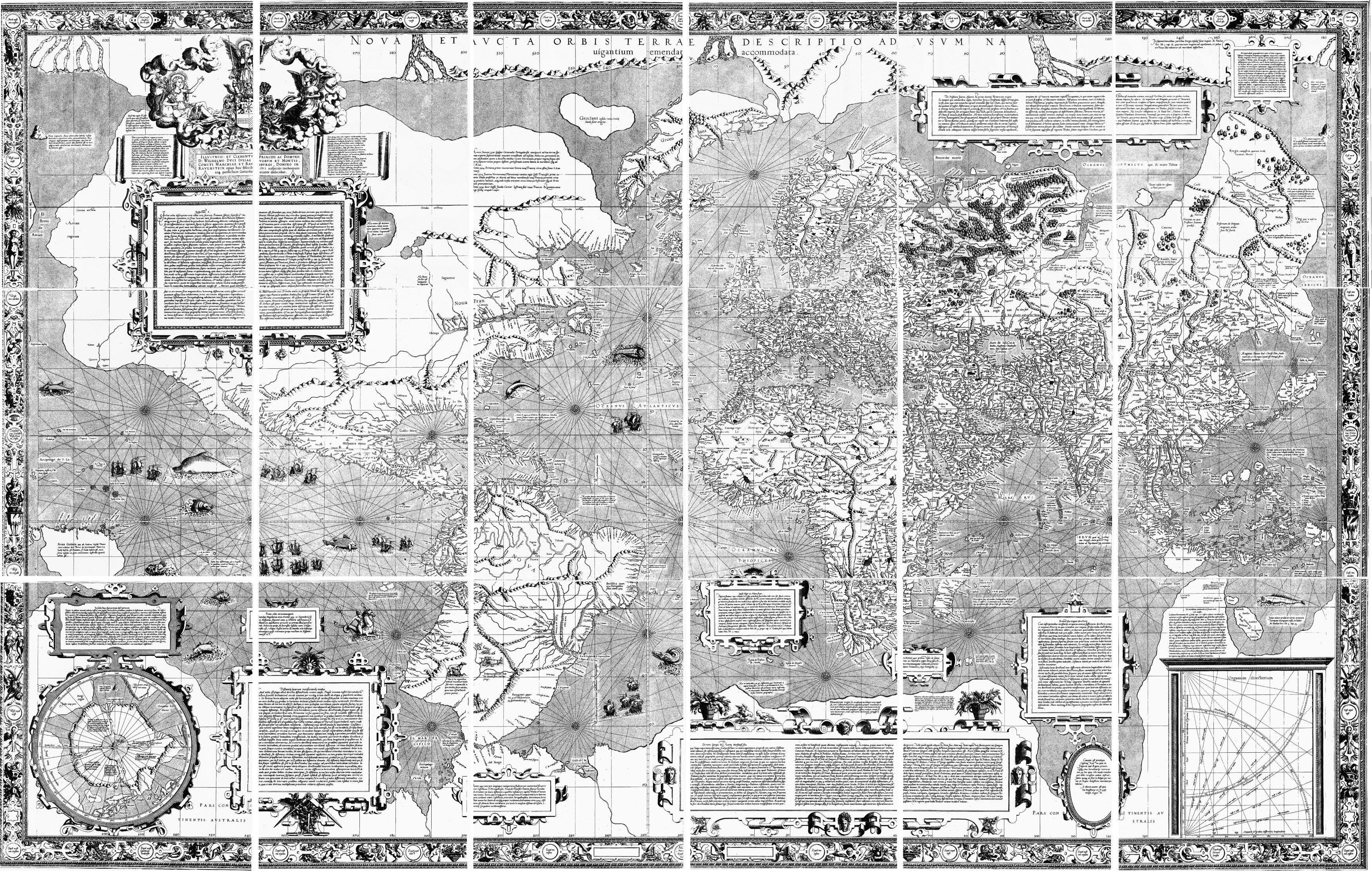
This map is a copy of the world map published by Gerardus Mercator in 1569 and nowadays kept in Basel. Mercator was a cartographer who went down in history for introducing what is possibly the most used and popular projection for centuries, as well as the most hated and criticised in recent decades.
It is therefore important to understand this projection in its historical context. In the 16th century, Europe was in the midst of the Age of Discovery. Navigation was a key element for the different countries to continue exploring the world, so it had to be efficient and reliable. And this is precisely where this projection really adds great value.
The Mercator projection is conformal, so angles and shapes are maintained throughout the plane. An indirect quality of this is that all the straight lines that can be drawn on the plane are possible navigational lines that a ship can maintain. This guarantees that it will get from one point on the map to another.
In other words, when James Cook was on his way to the Pacific Ocean with one of these maps in hand, he was sure that by keeping his course along a straight line on the map he could get easily from Madagascar to India. It is important to stress that this does not guarantee that this line will be the shortest distance, but it will be the one that will require the least additional navigational calculations1.
Peters, activism with many greys

In the 20th century, the voices against the Mercator projection became louder. The fundamental criticism is that the map designed by Gerardus Mercator had an imperialist intention and that it intentionally under-represented the countries of the Southern Hemisphere, over-representing Europe and North America.
I always like to emphasize that this is a consequence, not the actual purpose of the map. The Mercator projection is compliant, with the great utility we have just seen, but it is not equivalent, so there are large discrepancies in the area. Contrary to what is often stated, the deformation mainly affects the areas near the poles, which appear with an extreme size, and the areas near the equator, which appear with a minimum size. Of course, South America and Africa are not in the Southern Hemisphere as some claim, but are crossed by the equator.
Arno Peters, a German filmmaker with a PhD in political propaganda, saw a great window of opportunity. Possibly drawing on his academic career, he held a series of lectures in which he presented Peters' projection, which he claimed was the most accurate representation of the world. And well, yes, this projection is equivalent, since it respects the areas of the different countries, but as a matter of compromise it completely destroys the shapes and distances.
The first obscure point of this story is that the projection he presented in Bonn in 1973 was not his own creation, but he was reusing a projection conceived by the cartographer James Gall in a scholarly paper in 1885. The second obscure point is that his work was by no means altruistic, for after convincing several countries and international institutions of the importance of adopting this new map, he began to charge for each of the reproductions sold. Today, in the midst of 2023, these reproductions still have a cost from which the heirs of Arno Peters continue to make a penny.
Winkel-Tripel, a good compromise
")
Like almost everything in life, this is not a question of extremes. The two projections we have just seen focused on preserving only one of the three fundamental characteristics of maps, but it is possible to find a compromise that allows us to create generic cartographic representations without a specific goal.
This is one of the three projections proposed by the German cartographer Oswald Winkel in 1921. The name tripel comes from the German for triple, which refers to the fundamental objective of this projection, which is precisely to minimise the three fundamental distortions: area, angles and distance. Several studies by mathematicians and cartographers in the following decades raised this map among the projections that achieve the greatest compromise.
In 1998, thanks to this growing popularity, the Winkel-Tripel projection replaced the Robinson projection as the projection used for maps created by the National Geographic Society. In the past 25 years, more and more administrations, universities and educational institutions are following the example set by National Geographic and including this projection in their textbooks.
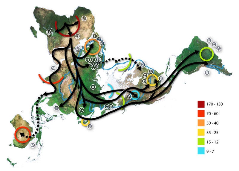
Dymaxion, a projection with a different objective

The problem with the Winkel-Tripel projection is that it seeks extreme compromise, so it lacks an objective beyond the intention of becoming the most faithful representation possible. This may be necessary, but it leaves a wide range of areas where maps are needed, and other projections can be used.
Perhaps one of the most unique projections is the one created by Buckminster Fuller in 1946, which resulted in the Dymaxion map you can see above. To transfer the information from the sphere to the plane, this projection approximates the earth to an icosahedron and makes an independent projection on each of the 20 faces of the icosahedron. Once this initial step has been completed, all that remains is to develop the polyhedron on a plane in a way that is most useful for the use of the map.
In this example of use, the icosahedron is developed with the aim of keeping all continents contiguous. Thanks to the peculiarity of this projection, we can easily see that all the continents of the Earth are located quite close to each other. This is probably the best projection to understand the migrations from Africa to the rest of the world. The arrows help with the direction the migrations followed, and the colours show the thousands of years that have passed since humans first arrived at each of the ends of the planet.
I cannot conclude an article about projections without mentioning one of the best works done by xkcd, which is this detailed, funny and quite accurate explanation of map projections.

By popular demand, here’s a button for procrastinating, in case you have plenty of things to do, but you don’t feel like. Each time you click on it, it will take you to a different map from the more than 1,100 in the catalogue.
If you like what you read, don’t hesitate to subscribe to receive an email with each new article that is published.
I’ve already written about geodesics in this other article: Unexpected curves: Drawing straight lines on a map.
Thank you for the post! I love maps and the way they can condense so much information.
Lovely, succinct and informative. Thank you.